


Ugliest Team Bike ever - Fuji Geox

 01-30-11, 07:28 PM
#3

Throw the stick!!!!

I am a Fuji guy and I still don't care much for that. With that said, I would still ride it any day of the week. 
__________________
I may be fat but I'm slow enough to make up for it.
01-30-11, 07:48 PM
#5
Team ABC Cycles
Join Date: Jan 2009
Location: Montreal Qc.
Posts: 600
Bikes: 2010 Colnago CX-1 and '12 S-Works Venge
Mentioned: 0 Post(s)
Tagged: 0 Thread(s)
Quoted: 0 Post(s)
Likes: 0
Liked 0 Times
in
0 Posts
01-30-11, 07:49 PM
#6
Senior Member

Join Date: Jan 2009
Location: Bristol, UK
Posts: 1,136
Mentioned: 0 Post(s)
Tagged: 0 Thread(s)
Quoted: 0 Post(s)
Likes: 0
Liked 0 Times
in
0 Posts
01-30-11, 08:15 PM
#7
fuggitivo solitario
 01-30-11, 08:19 PM
#8
Senior Member
Took the words right out of my mouth.
I used to train in a full mapei kit. I used to be fast too. heh. One of the teammates (four? of us trained in mapei kits) said that he liked the kit because, frankly, "You gotta go fast if you're wearing a clown suit".
I like that bike. I think they need yellow decals for the wheels. But I like that bike.
 01-30-11, 10:03 PM
#12

Elitist

Join Date: Jul 2005
Location: Atlanta, GA
Posts: 15,965
Mentioned: 88 Post(s)
Tagged: 0 Thread(s)
Quoted: 1386 Post(s)
Liked 92 Times
in
77 Posts
The graphics on most (not all) road bikes are pretty atrocious to me...include my Tarmac. I wish someone with some insight into the process would shed some light on this part of the process.
01-30-11, 10:38 PM
#14
Making a kilometer blurry

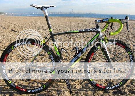
It's a Fuji Altamira, not a Fuji Geox. It's an ugly color scheme for the Geox-TMC team, yes, but the bike is fine. The photographer taking that shot with the sand/footprint texture in the background was out of his/her mind. A shallower DoF and a lower camera would have helped immensely. Probably just couldn't think straight with the twisted brain after looking at those colors.

01-31-11, 12:13 AM
#17
Senior Member
Join Date: Nov 2009
Posts: 7,075
Mentioned: 2 Post(s)
Tagged: 0 Thread(s)
Quoted: 2 Post(s)
Likes: 0
Liked 4 Times
in
4 Posts
the last two bikes i built i matched the saddle, hoods, and cable housing. in some situations i think it looks better than a matched saddle and bar tape.
the above bike has so much going on matching wouldnt manner. if it were given to me i would change the hoods and cable housing to red. if it's going to be obnoxious, make it obnoxious
the above bike has so much going on matching wouldnt manner. if it were given to me i would change the hoods and cable housing to red. if it's going to be obnoxious, make it obnoxious
01-31-11, 12:18 AM
#18
cowboy, steel horse, etc

Join Date: Sep 2008
Location: The hot spot.
Posts: 44,843
Bikes: everywhere
Mentioned: 71 Post(s)
Tagged: 1 Thread(s)
Quoted: 12774 Post(s)
Liked 7,692 Times
in
4,081 Posts
It's a Fuji Altamira, not a Fuji Geox. It's an ugly color scheme for the Geox-TMC team, yes, but the bike is fine. The photographer taking that shot with the sand/footprint texture in the background was out of his/her mind. A shallower DoF and a lower camera would have helped immensely. Probably just couldn't think straight with the twisted brain after looking at those colors.

 01-31-11, 05:12 AM
#20

Senior Member
The Gold chain gives it a unique accent. Turn the lime green to gold and it might look half way normal.
__________________
Pray for the Dead and Fight like Hell for the Living
^ Since January 1, 2012
Pray for the Dead and Fight like Hell for the Living
^ Since January 1, 2012
01-31-11, 07:51 AM
#21
Making a kilometer blurry
 you don't by chance drive a Gran Torino do you?
01-31-11, 08:03 AM
you don't by chance drive a Gran Torino do you?
01-31-11, 08:03 AM
#22
Announcer
I'm sure they carefully placed the tire tracks in the sand to gently lead the viewer's eye toward the subject. Or maybe away from it.
And the oil tanks in the distant background offer an industrial park undertone which totally fits with where this bike will be raced by the Cat-4 Masters.
And the oil tanks in the distant background offer an industrial park undertone which totally fits with where this bike will be raced by the Cat-4 Masters.
01-31-11, 10:59 AM
#23
impressive member

Join Date: Sep 2004
Location: fort collins
Posts: 2,706
Bikes: c'dale supersix, jamis trilogy, spec. tricross
Mentioned: 0 Post(s)
Tagged: 0 Thread(s)
Quoted: 1 Post(s)
Likes: 0
Liked 2 Times
in
2 Posts
not as ugly as the radioshack madones
like.. the only real catastrophe there is the wheels, and if they got some custom decals for the wheels theyd be fine.
the RS treks are just a total disaster.
like.. the only real catastrophe there is the wheels, and if they got some custom decals for the wheels theyd be fine.
the RS treks are just a total disaster.
01-31-11, 11:01 AM
#24
I don't know.

Join Date: May 2003
Location: South Meriden, CT
Posts: 2,015
Bikes: '90 B'stone RB-1, '92 B'stone RB-2, '89 SuperGo Access Comp, '03 Access 69er, '23 Trek 520, '14 Ritchey Road Logic, '09 Kestrel Evoke, '08 Windsor Tourist, '17 Surly Wednesday, '89 Centurion Accordo, '15 CruX, '17 Ridley X-Night, '89 Marinoni
Mentioned: 2 Post(s)
Tagged: 0 Thread(s)
Quoted: 317 Post(s)
Liked 853 Times
in
446 Posts
I'd hit it.
01-31-11, 08:40 PM
#25
Senior Member
Join Date: Jan 2008
Posts: 156
Mentioned: 0 Post(s)
Tagged: 0 Thread(s)
Quoted: 0 Post(s)
Likes: 0
Liked 0 Times
in
0 Posts
Cycling seems to have gone the way of skiing/snowboarding gear and fashion. The more mish mash of colors and designs.....the cooler it is.