


Jersey and Kit design
 02-21-14, 05:04 PM
#1
Announcer
Thread Starter
Jersey and Kit design
The racing component of our club redesigns their kit every three years. We're heading into the design phase now.
One idea is to return to a very basic and simple design. Almost retro, but not really.
The other idea is to go wild and off the chart.
Which camp do you align with? And what are your thoughts about kit design?
What works? And what doesn't?
FWIW, here are my thoughts:
- Less is more. Bold solid colors are much stronger than, say, something like the old HTC jerseys with the painted-on abs. Or a Slipstream argyle.
- The more stuff you put on your jersey, the more invisible it becomes in the field.
- Sponsors should only appear on the back pockets because that's where you get the most impressions/views.
- I want something that I can wear into a convenience store without looking like a child wearing superhero pajamas.
 02-21-14, 05:41 PM
#2

Senior Member
^your thoughts put you in the basic/simple/almost-retro camp.
Personally I want a clown suit kit, like Mapei or similar. Ironically I race for a club that has a basic/simple/almost-retro look (aka BMC look).
I agree that the busier a kit the less noticeable it becomes. It's like that Italian team with 8000 sponsors, even the announcers didn't know what to call them. Gilberto Simoni raced for them. Serramenti PVC Diquigiovanni Androni Giocattoli. It's like a charity t-shirt with 50 logos on the front and 100 on the rear. None stand out.
__________________
"...during the Lance years, being fit became the No. 1 thing. Totally the only thing. It�s a big part of what we do, but fitness is not the only thing. There�s skills, there�s tactics � there�s all kinds of stuff..." Tim Johnson
"...during the Lance years, being fit became the No. 1 thing. Totally the only thing. It�s a big part of what we do, but fitness is not the only thing. There�s skills, there�s tactics � there�s all kinds of stuff..." Tim Johnson
02-21-14, 06:01 PM
#3

**** that

Join Date: Dec 2006
Location: CALI
Posts: 15,402
Mentioned: 151 Post(s)
Tagged: 0 Thread(s)
Quoted: 1099 Post(s)
Liked 104 Times
in
30 Posts
Seriously, if you're trying to make some construction worker not think you're gay or a superhero, we've already lost that battle. Might as well be a pink kit with a unicorn puking a rainbow. (I believe that kit exists btw!)
02-21-14, 06:03 PM
#4
Announcer
Thread Starter
I'm the Mayor of Almost-Retro Camp.
Somewhere in the 80s, when someone figured out the sublimation process, things went awry. I've been fighting to bring it back to center ever since.
Instead, we look like we belong in Marvel Comics.
I'm just curious where other people stand on this so I can start formulating my presentation to the team.
02-21-14, 07:31 PM
#6
Announcer
Thread Starter
02-21-14, 07:35 PM
#7
Senior Member
Join Date: Jan 2006
Location: Redlands, CA
Posts: 6,313
Mentioned: 31 Post(s)
Tagged: 0 Thread(s)
Quoted: 842 Post(s)
Liked 469 Times
in
250 Posts
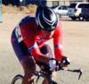
At first I didn't like our kit, but its grown on me.
https://instagram.com/p/kAck-Fjp_p/
Of course going into a convienence store you'll look like a super hero. Can't tell you how many robberies I've stopped just trying buy Fig Newtons!
https://instagram.com/p/kAck-Fjp_p/
Of course going into a convienence store you'll look like a super hero. Can't tell you how many robberies I've stopped just trying buy Fig Newtons!
02-22-14, 12:47 PM
#8
Senior Member
Join Date: Jun 2010
Location: Western MA
Posts: 15,669
Bikes: Yes
Mentioned: 4 Post(s)
Tagged: 0 Thread(s)
Quoted: 9 Post(s)
Likes: 0
Liked 0 Times
in
0 Posts
I am not a full retro fan. I raced in those kits in the 80's, and that's where they belong. Neo-retro, to me at least, means a large main sponsor or club name, and less clutter. Nothing wrong with that. Colors and patterns are what get you noticed in the field, more so than style. Style only really gets noticed in podium pictures. Post up your mock-ups and we'll tear 'em apart.
02-22-14, 12:51 PM
#9
Banned.
Join Date: Dec 2010
Location: ohioland/right near hicville farmtown
Posts: 4,813
Mentioned: 0 Post(s)
Tagged: 0 Thread(s)
Quoted: 0 Post(s)
Likes: 0
Liked 1 Time
in
1 Post
i like panther's old design (for like 2 yers ago). full black, with panther written across the front and back, and competitive cyclist written on the back under panther. Nothing more, nothing less.
edit: they also had a few small logos on the thighs, and shoulders, but ti just was so simplistic and nice!
edit: they also had a few small logos on the thighs, and shoulders, but ti just was so simplistic and nice!
02-22-14, 06:32 PM
#10
ride lots be safe
Join Date: Jan 2007
Location: Texas
Posts: 5,224
Mentioned: 0 Post(s)
Tagged: 0 Thread(s)
Quoted: 13 Post(s)
Likes: 0
Liked 1 Time
in
1 Post
match your primary sponsor's color scheme
white tops for hot summers, hi-viz for safety
make it distinctive when seen from the rear so your guy up the road doesn't look like the other team's guy
make logos / sponsor names legible, big plain fonts
white tops for hot summers, hi-viz for safety
make it distinctive when seen from the rear so your guy up the road doesn't look like the other team's guy
make logos / sponsor names legible, big plain fonts
02-26-14, 02:26 PM
#11
Senior Member
Join Date: Nov 2012
Location: Palm Desert, CA
Posts: 2,504
Bikes: Speedvagen Steel
Mentioned: 11 Post(s)
Tagged: 0 Thread(s)
Quoted: 429 Post(s)
Liked 248 Times
in
156 Posts
So out of my own curiosity what do you folks think of this? One of the pieces of business that I operate as part of the resort include a new lift accessed Mtn Bike park that we opened last summer and will be expanding for the foreseeable future. We have nice MTB jerseys that we sell to the public, nice design that we did in partnership with Kali.
Still there are a few that do a fair bit of XC and myself on the road of course. We have a good clientel and members that would probably like something a little different. I'm thinking of doing a small run pre-sales of a kit for us. Here's where I am with design so far. Uses both our bike park logo as well as our main resort logo, proper logo colors, etc. I didn't want it too bland nor too gaudy. I'm thinking of the version with white stitching. The back has the logo on the upper back, each pocket has some small screening. lower back panel of bibs has website.
Curious to know opinions.
 02-26-14, 03:14 PM
#13
Senior Member
Join Date: Jan 2006
Location: Redlands, CA
Posts: 6,313
Mentioned: 31 Post(s)
Tagged: 0 Thread(s)
Quoted: 842 Post(s)
Liked 469 Times
in
250 Posts
SoCalCycling.com did an article on this year's kits in the area;
https://socalcycling.com/2014/01/27/s...cling-jerseys/
https://socalcycling.com/2014/01/27/s...cling-jerseys/
02-26-14, 03:21 PM
#14
Senior Member
Join Date: Jul 2009
Posts: 1,001
Mentioned: 0 Post(s)
Tagged: 0 Thread(s)
Quoted: 0 Post(s)
Likes: 0
Liked 0 Times
in
0 Posts
 02-26-14, 07:35 PM
#18
Senior Member

Join Date: Oct 2010
Location: San Francisco, CA
Posts: 3,059
Mentioned: 0 Post(s)
Tagged: 0 Thread(s)
Quoted: 4 Post(s)
Likes: 0
Liked 1 Time
in
1 Post
I'm a big fan of ours (biased).
2013

2014

Subtle difference but we wanted people who ordered this years kit to still blend in with those who purchased last year's kit. The greyscale on the back is an elevation profile of the most popular riding loops in the area.
Obviously this is a more club-oriented kit, but the same basic principles would apply for a race-specific jersey. Minimalist design, bold, but not over the top colors. Sponsors on the back pockets.
2013
2014
Subtle difference but we wanted people who ordered this years kit to still blend in with those who purchased last year's kit. The greyscale on the back is an elevation profile of the most popular riding loops in the area.
Obviously this is a more club-oriented kit, but the same basic principles would apply for a race-specific jersey. Minimalist design, bold, but not over the top colors. Sponsors on the back pockets.

 02-26-14, 10:12 PM
#23
Senior Member
Join Date: Jul 2005
Location: Portland, OR
Posts: 2,910
Mentioned: 2 Post(s)
Tagged: 0 Thread(s)
Quoted: 140 Post(s)
Liked 327 Times
in
161 Posts
I'm the Mayor of Almost-Retro Camp.
Somewhere in the 80s, when someone figured out the sublimation process, things went awry. I've been fighting to bring it back to center ever since.
Instead, we look like we belong in Marvel Comics.
I'm just curious where other people stand on this so I can start formulating my presentation to the team.
Somewhere in the 80s, when someone figured out the sublimation process, things went awry. I've been fighting to bring it back to center ever since.
Instead, we look like we belong in Marvel Comics.
I'm just curious where other people stand on this so I can start formulating my presentation to the team.
02-26-14, 10:52 PM
#24
�\_(ツ)_/�

Join Date: Jun 2008
Location: Redwood City, CA
Posts: 10,978
Bikes: aggressive agreement is what I ride.
Mentioned: 109 Post(s)
Tagged: 0 Thread(s)
Quoted: 967 Post(s)
Likes: 0
Liked 4 Times
in
4 Posts
I like my team's new kit.

I think we all agree about the Hamburglar team. That's pretty awful. Sorry, guy.
I think we all agree about the Hamburglar team. That's pretty awful. Sorry, guy.
02-26-14, 11:00 PM
#25
Senior Member
Join Date: Jan 2006
Location: Redlands, CA
Posts: 6,313
Mentioned: 31 Post(s)
Tagged: 0 Thread(s)
Quoted: 842 Post(s)
Liked 469 Times
in
250 Posts
I really like Jandro's kit; except those purple and pink stripes. Regardless, people are going to be too busy looking at those awesome beards!