


Any plans for a 2010 BF Norcal jersey ?

 03-17-10, 02:34 PM
#54
RacingBear
 03-17-10, 03:16 PM
#55

Dolce far niente

Join Date: Dec 2004
Location: Northern CA
Posts: 10,704
Mentioned: 15 Post(s)
Tagged: 0 Thread(s)
Quoted: 20 Post(s)
Likes: 0
Liked 17 Times
in
14 Posts
By Jove, you're right! Alex, turn it up the other way - give it a little "Johnny Cash" vibe.
__________________
"Love is not the dying moan of a distant violin, it�s the triumphant twang of a bedspring."
S. J. Perelman
"Love is not the dying moan of a distant violin, it�s the triumphant twang of a bedspring."
S. J. Perelman
03-17-10, 03:29 PM
#56
Direct Hit Not Required

Join Date: Nov 2003
Location: San Bruno, CA
Posts: 6,193
Bikes: Leopard DC1, Ridley X-Fire, GT Zaskar 9r
Mentioned: 0 Post(s)
Tagged: 0 Thread(s)
Quoted: 2 Post(s)
Likes: 0
Liked 1 Time
in
1 Post
03-17-10, 04:17 PM
#57
Dolce far niente
Join Date: Dec 2004
Location: Northern CA
Posts: 10,704
Mentioned: 15 Post(s)
Tagged: 0 Thread(s)
Quoted: 20 Post(s)
Likes: 0
Liked 17 Times
in
14 Posts

__________________
"Love is not the dying moan of a distant violin, it�s the triumphant twang of a bedspring."
S. J. Perelman
"Love is not the dying moan of a distant violin, it�s the triumphant twang of a bedspring."
S. J. Perelman
03-17-10, 04:44 PM
#58
Senior Member
Thread Starter

Join Date: Aug 2009
Location: Bay Area, CA
Posts: 179
Mentioned: 0 Post(s)
Tagged: 0 Thread(s)
Quoted: 0 Post(s)
Likes: 0
Liked 0 Times
in
0 Posts
 03-17-10, 04:59 PM
#60
ES&D
Join Date: Oct 2006
Location: Roadieville, USA
Posts: 1,377
Bikes: 3Rensho, Merlin XL, Melton custom, Michael Johnson tandem, Look 481SL, Pedal Force RS
Mentioned: 0 Post(s)
Tagged: 0 Thread(s)
Quoted: 1 Post(s)
Likes: 0
Liked 0 Times
in
0 Posts
 03-17-10, 05:11 PM
#61
Senior Member
Thread Starter
Join Date: Aug 2009
Location: Bay Area, CA
Posts: 179
Mentioned: 0 Post(s)
Tagged: 0 Thread(s)
Quoted: 0 Post(s)
Likes: 0
Liked 0 Times
in
0 Posts
03-17-10, 09:32 PM
#62
moth -----> flame

Join Date: Dec 2007
Location: SF Bay Area
Posts: 5,916
Bikes: 11 CAAD 10-4, 07 Specialized Roubaix Comp, 98 Peugeot Horizon
Mentioned: 0 Post(s)
Tagged: 0 Thread(s)
Quoted: 1 Post(s)
Likes: 0
Liked 2 Times
in
2 Posts
Dumb question: "Brev" as in Brevet?
Now if only we can sneak in a tiny "HTFU" in there somewhere, discreet enough not to get too many questions from inquiring non-riding spouses and kids....
Now if only we can sneak in a tiny "HTFU" in there somewhere, discreet enough not to get too many questions from inquiring non-riding spouses and kids....
__________________
BF, in a nutshell
BF, in a nutshell
03-17-10, 09:38 PM
#63
RacingBear
03-17-10, 10:09 PM
#65
moth -----> flame
Join Date: Dec 2007
Location: SF Bay Area
Posts: 5,916
Bikes: 11 CAAD 10-4, 07 Specialized Roubaix Comp, 98 Peugeot Horizon
Mentioned: 0 Post(s)
Tagged: 0 Thread(s)
Quoted: 1 Post(s)
Likes: 0
Liked 2 Times
in
2 Posts
Thanks BBM - no doubt the absence of campy in my garage is to blame.
__________________
BF, in a nutshell
BF, in a nutshell
03-17-10, 11:22 PM
#67
phony collective progress

Join Date: Sep 2006
Location: San Hoosey
Posts: 2,973
Bikes: https://velospace.org/user/36663
Mentioned: 0 Post(s)
Tagged: 0 Thread(s)
Quoted: 0 Post(s)
Likes: 0
Liked 4 Times
in
3 Posts
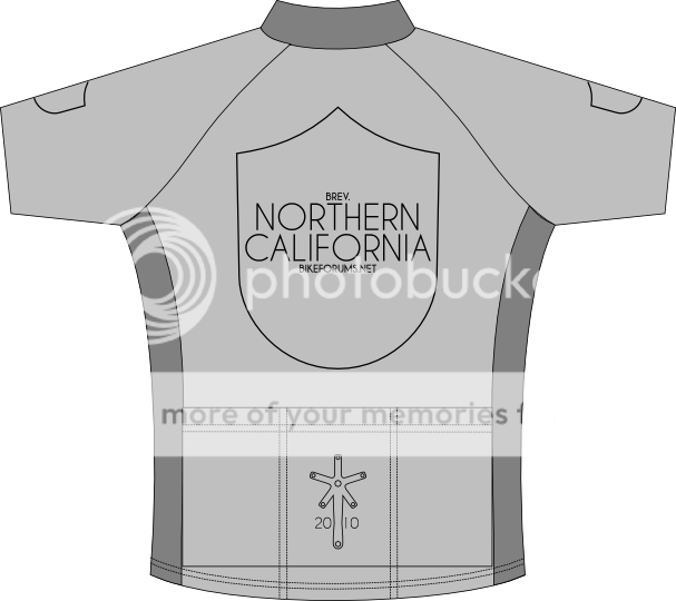
I do not. I was actually working on another design when I took a small part of it (the shield outline) and dropped it on a jersey drawing. That's as far as I got.
Heh, kind of does in the small version. It's more clearly a crank at larger sizes.
Gonna bust up my muted/silver vibe with color? Bah!
Well, I guess the side panels and collar could be a darkish blue.
Yeah guys, hold the vote until someone who isn't a minimalist hack posts something. 
Heh, kind of does in the small version. It's more clearly a crank at larger sizes.
Well, I guess the side panels and collar could be a darkish blue.
__________________

03-18-10, 12:03 AM
#68
Dolce far niente
Join Date: Dec 2004
Location: Northern CA
Posts: 10,704
Mentioned: 15 Post(s)
Tagged: 0 Thread(s)
Quoted: 20 Post(s)
Likes: 0
Liked 17 Times
in
14 Posts
Here's a general thought on color - if you use the same blue/white colors as last year, we can wear the new jerseys with the bibs we already have. Just a thought.
Also, don't sell minimalism short - I'm totaly on board with the less is more concept.
I'm dying to see what Curtis comes up with!
Also, don't sell minimalism short - I'm totaly on board with the less is more concept.
I'm dying to see what Curtis comes up with!
__________________
"Love is not the dying moan of a distant violin, it�s the triumphant twang of a bedspring."
S. J. Perelman
"Love is not the dying moan of a distant violin, it�s the triumphant twang of a bedspring."
S. J. Perelman
03-18-10, 12:42 AM
#69
Erect member since 1953

Join Date: Dec 2006
Location: Antioch, CA (SF Bay Area)
Posts: 7,000
Bikes: Trek 520 Grando, Roubaix Expert, Motobecane Ti Century Elite turned commuter, Some old French thing gone fixie
Mentioned: 8 Post(s)
Tagged: 0 Thread(s)
Quoted: 121 Post(s)
Likes: 0
Liked 38 Times
in
21 Posts
Really, I'm just messing about while the J students do the newspaper.
I really liked Alex's ideas last year. I wasn't nuts about the color, but MyLilPony really liked them. So x136 let me mess with his files.
I'm really tired of painfully symmetrical jerseys, so I was thinking big, overall design. This is by no means close to a proposal, but I am liking the non-centered idea.
Is that enough of a disclaimer?
03-18-10, 08:00 AM
#70
moth -----> flame
Join Date: Dec 2007
Location: SF Bay Area
Posts: 5,916
Bikes: 11 CAAD 10-4, 07 Specialized Roubaix Comp, 98 Peugeot Horizon
Mentioned: 0 Post(s)
Tagged: 0 Thread(s)
Quoted: 1 Post(s)
Likes: 0
Liked 2 Times
in
2 Posts
I'm starting to dig Alex's clean lines here (well his jersey's clean lines, at any rate). I am also partial to that font. I could see that working as is, or with white/black (better blend with all the darn pairs of black bibs we have?) or white/blue.
I like the idea of a jersey that is recognisable to the group, and different from all the other event jerseys you see around, i.e. something like a team kit; the revised hill/poppy design looks more like an event than a team jersey to me. Do you have a bib design in mind Alex?
__________________
BF, in a nutshell
BF, in a nutshell
03-18-10, 09:00 AM
#71

Senior Member
Join Date: Jun 2008
Location: Near Sacramento
Posts: 4,886
Mentioned: 0 Post(s)
Tagged: 0 Thread(s)
Quoted: 2 Post(s)
Likes: 0
Liked 0 Times
in
0 Posts
Curtis, the text is awfully biased toward those of you in West NorCal. I think my preference would be to avoid text other than NorCal BikeForums, etc. Make it more general?
Design is pretty good, though that's an awful lot of a dark green.
Design is pretty good, though that's an awful lot of a dark green.
__________________
-------
Some sort of pithy irrelevant one-liner should go here.
-------
Some sort of pithy irrelevant one-liner should go here.
03-18-10, 05:36 PM
#72
Senior Member
Join Date: Jul 2005
Location: Davis, CA
Posts: 1,183
Bikes: K2 Zed 3.0; Motobecane Le Champion; Pedal Force RS; IRO BFGB
Mentioned: 0 Post(s)
Tagged: 0 Thread(s)
Quoted: 0 Post(s)
Likes: 0
Liked 0 Times
in
0 Posts
Our team kits has HTFU discreetly printed on the inside back of the jersey collar constantly pressing against the back of our necks encouraging us to push a little bit further.
03-18-10, 11:03 PM
#73
DoubleTrouble
Join Date: Dec 2006
Location: Vacaville, CA
Posts: 599
Bikes: 06 Co-Motion Tandem, Fuji Team Pro mine,-Hers, Specialized Dolce
Mentioned: 0 Post(s)
Tagged: 0 Thread(s)
Quoted: 0 Post(s)
Likes: 0
Liked 0 Times
in
0 Posts
Curtis, I RR and I did not care for the checkers either. I can't help flashing on "The Checkered Demon" when I look at them. Anyone here remember that? I liked the one that you took this new design from. I like colors. FWIW.
03-18-10, 11:18 PM
#74
phony collective progress
Join Date: Sep 2006
Location: San Hoosey
Posts: 2,973
Bikes: https://velospace.org/user/36663
Mentioned: 0 Post(s)
Tagged: 0 Thread(s)
Quoted: 0 Post(s)
Likes: 0
Liked 4 Times
in
3 Posts
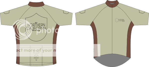
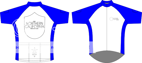
As much as I like the silver, here are some colors for the non-chromaphobes.
Waxed canvas and leather brown:
Blue and white:
Black & white:
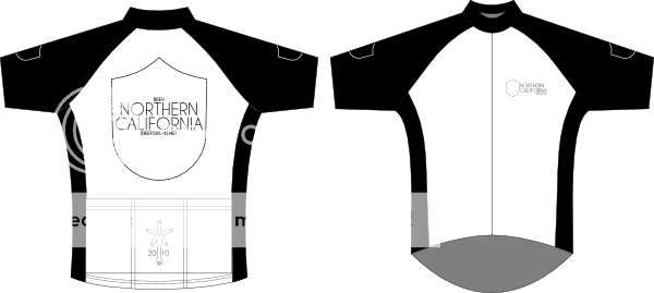
I think the last two lose the vintage vibe, and may cross the line into being law-enforcement-esque. Plus, the black would be too hot, and the blue would be the same colors as last year.

Wouldn't be hard. Matching colors, maybe with a shield (or a flying QR wheel) on the outside of each leg.
That's a problem I ran into last year. It was hard to get around it being a "Bay Area (and surrounding slums)" jersey when road names were included.
Also, I don't think anyone shares this opinion, but I'll throw it out there: I really don't like the "Norcal" abbreviation.
That said, I like the Diablo/winding road/poppy design writ large across the jersey.
Waxed canvas and leather brown:
Blue and white:
Black & white:
I think the last two lose the vintage vibe, and may cross the line into being law-enforcement-esque. Plus, the black would be too hot, and the blue would be the same colors as last year.
Wouldn't be hard. Matching colors, maybe with a shield (or a flying QR wheel) on the outside of each leg.
Also, I don't think anyone shares this opinion, but I'll throw it out there: I really don't like the "Norcal" abbreviation.
That said, I like the Diablo/winding road/poppy design writ large across the jersey.
__________________
03-19-10, 12:08 AM
#75
Dolce far niente
Join Date: Dec 2004
Location: Northern CA
Posts: 10,704
Mentioned: 15 Post(s)
Tagged: 0 Thread(s)
Quoted: 20 Post(s)
Likes: 0
Liked 17 Times
in
14 Posts
I like the first two. Also, the that canvas color might look good with a muted brick/adobe type red. Or maybe a cream color with the brick red. I think you're on to something with the muted earth tone type pairs, although I do kind of dig the blue and white.
I agree with you on the NorCal thing.
__________________
"Love is not the dying moan of a distant violin, it�s the triumphant twang of a bedspring."
S. J. Perelman
"Love is not the dying moan of a distant violin, it�s the triumphant twang of a bedspring."
S. J. Perelman