


New 41 kit -- Requests and opinions

 05-24-14, 06:04 PM
#27
Senior Member
Join Date: Oct 2007
Location: san diego
Posts: 2,981
Bikes: custom caad9
Mentioned: 0 Post(s)
Tagged: 0 Thread(s)
Quoted: 4 Post(s)
Likes: 0
Liked 3 Times
in
3 Posts
Now THIS!
We have some concept. I like the FOURTYONE idea, but I flipped it to read FOURTYONE to highlight the singular, the individuals that make these threads come alive...which is also why I also set the word ONE in the three colors of the BD flame. Each one of us makes up the the entirety of this circus called the 41.
The five stripes (alternating grey and blue) pay homage to the world champ stripes, but are stripped of color almost as an inside joke...we're no world champs here.
The colors come into play one the left sleeve, where I have formed tiny crosses (referencing the symbol for "planet earth"), each quarter a color from the world stripes with the center being black (see detail screen shot.)
On the center pocket is the quote by Ernest Hemingway.
This is a digital rough. I am still exploring variations and ideas but this starts to show what I have in mind.
It starts to incorporate more concept and idea behind these forums in a semi-original way. People will KNOW this is a BF kit, a black kit with white lettering looks like Above Category and they already do it right.
Last edited by enjoi07; 05-24-14 at 06:09 PM.
05-24-14, 07:43 PM
#28
Coffin Dodger
Join Date: Mar 2013
Location: New Hampshire
Posts: 2,138
Bikes: Motobecane Vent Noir, Lynskey R345, Serotta Nova Special X
Mentioned: 11 Post(s)
Tagged: 1 Thread(s)
Quoted: 794 Post(s)
Liked 292 Times
in
143 Posts
40 (forty) is the natural number following 39 and preceding 41.
Despite being related to the word "four" (4), 40 is spelled "forty", and not "fourty". The reason is that etymologically (also in accents without the horse–hoarse merger) the words have different vowels.[citation needed] "Forty" containing a contraction in the same way that "fifty" contains a contraction of "five".
Subtle inside jokes are ok, but the misspelled forty is to much. IMAO
I like the Hemingway quote idea if it's legible
Pirk
05-24-14, 08:13 PM
#29

Senior Member

**** the ******* out of the ******, and the ****** they rode in on.
Then *** with the ****** of ***** ********* *** and eat a Graham ******* and get your paintball *** and ***** *** *******!
Then *** with the ****** of ***** ********* *** and eat a Graham ******* and get your paintball *** and ***** *** *******!
__________________
Momento mori, amor fati.
Momento mori, amor fati.
05-25-14, 01:03 AM
#31
Senior Member
Thread Starter
Join Date: Apr 2013
Location: Los Angeles
Posts: 438
Bikes: 2013 Cannondale SuperSix - 1998 CAAD3 R500 - 2012 Demo 8 Carbon
Mentioned: 0 Post(s)
Tagged: 0 Thread(s)
Quoted: 13 Post(s)
Likes: 0
Liked 0 Times
in
0 Posts
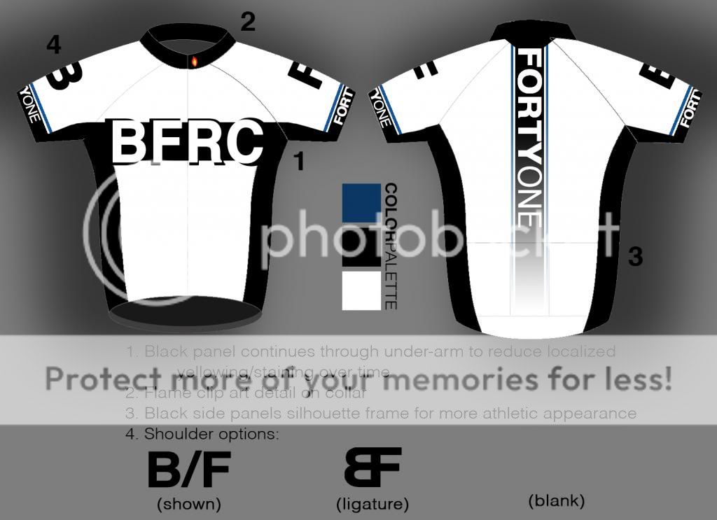
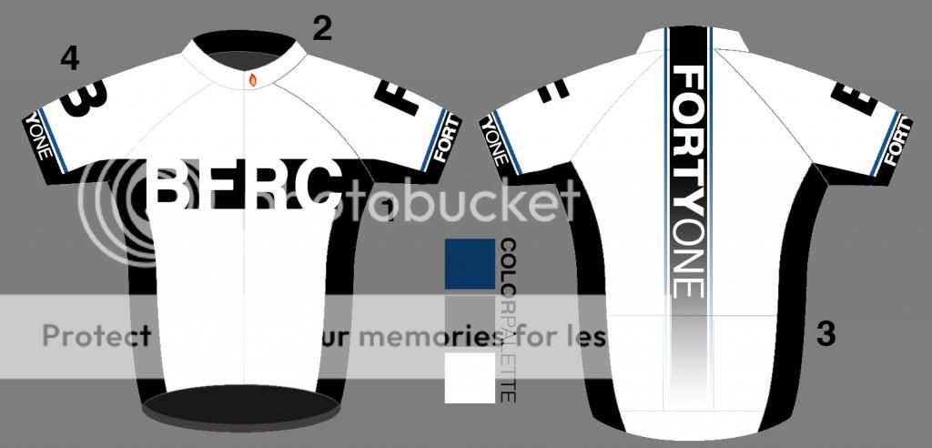
Here are the color highlights some of you asked for as well as a white iteration because several of you also mentioned that. Thanks for all the feedback!
Last edited by EnsitMike; 05-25-14 at 03:34 AM.
05-25-14, 01:12 AM
#32
Senior Member

The reason I like Primal jerseys is that their sizing is known quantity, I know what to expect. Not so much with other manufacturers. FWIW, I think I've bought my last pair of bike shorts, much prefer bibs.
As to the design, I like the latest iteration above, but would prefer "41" on each shoulder over the "BF" options.
All in all, good work!
As to the design, I like the latest iteration above, but would prefer "41" on each shoulder over the "BF" options.
All in all, good work!


 05-25-14, 08:00 AM
#34
Thread Killer
Join Date: Aug 2008
Location: Ann Arbor, MI
Posts: 12,432
Bikes: 15 Kinesis Racelight 4S, 76 Motebecane Gran Jubil�e, 17 Dedacciai Gladiatore2, 12 Breezer Venturi, 09 Dahon Mariner, 12 Mercier Nano, 95 DeKerf Team SL, 19 Tern Rally, 21 Breezer Doppler Cafe+, 19 T-Lab X3, 91 Serotta CII, 23 3T Strada
Mentioned: 30 Post(s)
Tagged: 0 Thread(s)
Quoted: 3134 Post(s)
Liked 1,701 Times
in
1,027 Posts
Enjoi07: also good designs!
05-25-14, 08:06 AM
#35
Senior Member
Visibility is a good thing. All black is not. Design is boring, go with fluorescent lime green or orange, something more visible and help us stay alive.
05-25-14, 10:41 AM
#36
Senior Member

Join Date: Dec 2010
Posts: 8,951
Mentioned: 0 Post(s)
Tagged: 0 Thread(s)
Quoted: 14 Post(s)
Likes: 0
Liked 13 Times
in
12 Posts
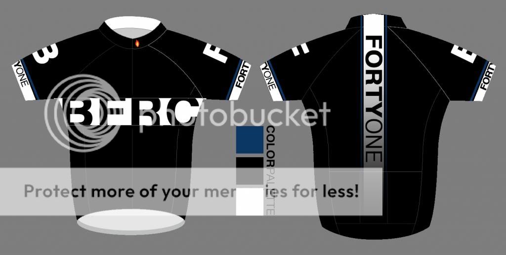
All black is good for self-conscious neurotics. Despite that, I do really like the version that's mainly white...a lot. When I first saw the black concept I was going to suggest switching black and white to make it somewhat similar to the Giant/Shimano kit. FWIW: I like Pactimo for custom stuff.
Last edited by Looigi; 05-25-14 at 10:51 AM.
05-25-14, 11:07 AM
#37
Senior Member

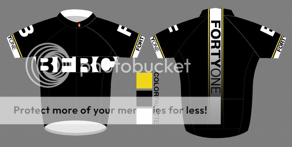
I'm liking this version, or the black with yellow. Very nicely done!

05-25-14, 12:15 PM
#38
Senior Member
Join Date: Oct 2007
Location: san diego
Posts: 2,981
Bikes: custom caad9
Mentioned: 0 Post(s)
Tagged: 0 Thread(s)
Quoted: 4 Post(s)
Likes: 0
Liked 3 Times
in
3 Posts
I don't know man, still looks poorly designed.
- The little flame is hokey (is that vector? will it reproduce well at scale if not?)
- The drop shadow on the BFRC on front is messy.
There is some good stuff going on, it just needs to be cleaned up:

- The little flame is hokey (is that vector? will it reproduce well at scale if not?)
- The drop shadow on the BFRC on front is messy.
There is some good stuff going on, it just needs to be cleaned up:


 05-25-14, 01:12 PM
#41
Senior Member
Join Date: Oct 2007
Location: san diego
Posts: 2,981
Bikes: custom caad9
Mentioned: 0 Post(s)
Tagged: 0 Thread(s)
Quoted: 4 Post(s)
Likes: 0
Liked 3 Times
in
3 Posts
Stars, on Bike Forums, identify members and moderators. If you pay for membership to BF you get a red star next to your name. Purple stars are for mods, etc.
(anyone chime in and correct me if I am wrong on that.)
Now that I think about it, that is why I did a neutral colored star on the last Bike Forums 41 jersey I designed. I did not want to do a red or purple star because that has a specific meaning, where a neutral star could signify a member in general, or in this case, someone who purchases a BF jersey...I think that is worthy of some kind of star
So yea, the star would most likely just stay black or grey on the jersey.
05-25-14, 01:26 PM
#42
Senior Member
Join Date: Jun 2013
Posts: 974
Bikes: One with square wheels
Mentioned: 0 Post(s)
Tagged: 0 Thread(s)
Quoted: 0 Post(s)
Likes: 0
Liked 0 Times
in
0 Posts
I dig the blue ones, not so much the black and white ones. It's more of a pattern thing as opposed to a color thing.
05-25-14, 01:56 PM
#43

Super Moderator

Join Date: Jul 2004
Location: Ffld Cnty Connecticut
Posts: 21,843
Bikes: Old Steelies I made, Old Cannondales
Mentioned: 12 Post(s)
Tagged: 0 Thread(s)
Quoted: 1173 Post(s)
Liked 927 Times
in
612 Posts
In general I don't like black jerseys due to poor visibility for inattentive drivers.
I have a couple and only use them as base layers in the winter.
I have a couple and only use them as base layers in the winter.
__________________
Bikes: Old steel race bikes, old Cannondale race bikes, less old Cannondale race bike, crappy old mtn bike.
FYI: https://www.bikeforums.net/forum-sugg...ad-please.html
Bikes: Old steel race bikes, old Cannondale race bikes, less old Cannondale race bike, crappy old mtn bike.
FYI: https://www.bikeforums.net/forum-sugg...ad-please.html
05-25-14, 02:04 PM
#44
Senior Member
Thread Starter
Join Date: Apr 2013
Location: Los Angeles
Posts: 438
Bikes: 2013 Cannondale SuperSix - 1998 CAAD3 R500 - 2012 Demo 8 Carbon
Mentioned: 0 Post(s)
Tagged: 0 Thread(s)
Quoted: 13 Post(s)
Likes: 0
Liked 0 Times
in
0 Posts
Now THIS!
We have some concept. I like the FOURTYONE idea, but I flipped it to read FOURTYONE to highlight the singular, the individuals that make these threads come alive...which is also why I also set the word ONE in the three colors of the BD flame. Each one of us makes up the the entirety of this circus called the 41.
The five stripes (alternating grey and blue) pay homage to the world champ stripes, but are stripped of color almost as an inside joke...we're no world champs here.
The colors come into play one the left sleeve, where I have formed tiny crosses (referencing the symbol for "planet earth"), each quarter a color from the world stripes with the center being black (see detail screen shot.)
On the center pocket is the quote by Ernest Hemingway.
This is a digital rough. I am still exploring variations and ideas but this starts to show what I have in mind.
It starts to incorporate more concept and idea behind these forums in a semi-original way. People will KNOW this is a BF kit, a black kit with white lettering looks like Above Category and they already do it right.
Now this. It's nice but I'm not a big fan of the baby blue theme going on, even if it is from the website. I like that you got conceptual with all the little details but I'm not sure people really identify with it. There is a lot of different colors going on too, with different fonts for the numbers and letters. Feels very chaotic and leaves me wanting something a little more assertive. The designs that you started doing trending off my theme were looking better, but again the baby blue-- and I wasn't sure what the red star was about. I know moderators have stars but that seemed a bit ambiguous. I'm definitely getting a quicksilver, volcom, surf culture vibe from them.
We'll see, hopefully more forum members will chime in.
05-25-14, 02:18 PM
#45
Senior Member
Thread Starter
Join Date: Apr 2013
Location: Los Angeles
Posts: 438
Bikes: 2013 Cannondale SuperSix - 1998 CAAD3 R500 - 2012 Demo 8 Carbon
Mentioned: 0 Post(s)
Tagged: 0 Thread(s)
Quoted: 13 Post(s)
Likes: 0
Liked 0 Times
in
0 Posts
All very good to my eye/sensibilities, but the top one is brilliant! I think the letter shadows that overrun the horizontal stripe give depth and wholeness; could that be applied to the black body/white stripe design? No matter, really, as the white version shown is a buy for me!
Enjoi07: also good designs!
Enjoi07: also good designs!
All black is good for self-conscious neurotics. Despite that, I do really like the version that's mainly white...a lot. When I first saw the black concept I was going to suggest switching black and white to make it somewhat similar to the Giant/Shimano kit. FWIW: I like Pactimo for custom stuff.
- It's not a drop shadow, moreso an expansion. It goes off each side adding a popping effect-- but regardless it is just a visual aid. All the refinements can be done once the forum has picked a final design.
We have a lot of people liking the white version so I think it's close.
05-25-14, 02:45 PM
#46
Senior Member

I really like how the design is developing.
Perhaps a discrete HTFU somewhere on the jersey would be in order?
It is, after all, the 41's defining acronym.
Perhaps a discrete HTFU somewhere on the jersey would be in order?
It is, after all, the 41's defining acronym.
05-25-14, 02:53 PM
#48
Senior Member
Join Date: Oct 2007
Location: san diego
Posts: 2,981
Bikes: custom caad9
Mentioned: 0 Post(s)
Tagged: 0 Thread(s)
Quoted: 4 Post(s)
Likes: 0
Liked 3 Times
in
3 Posts
Now this. It's nice but I'm not a big fan of the baby blue theme going on, even if it is from the website. I like that you got conceptual with all the little details but I'm not sure people really identify with it. There is a lot of different colors going on too, with different fonts for the numbers and letters. Feels very chaotic and leaves me wanting something a little more assertive. The designs that you started doing trending off my theme were looking better, but again the baby blue-- and I wasn't sure what the red star was about. I know moderators have stars but that seemed a bit ambiguous. I'm definitely getting a quicksilver, volcom, surf culture vibe from them.
We'll see, hopefully more forum members will chime in.
We'll see, hopefully more forum members will chime in.
Colors are intended to be midnight blue and a light silver/grey. The colors render different from screen to screen.
Numbers and letters are exact same font.
It's all going in a decent direction. Maybe something even more minimal is in order.
05-25-14, 03:18 PM
#49
Junior Member
Join Date: Apr 2013
Posts: 6
Bikes: Trek Domane 2.0, Specialized Hardrock 29SD
Mentioned: 0 Post(s)
Tagged: 0 Thread(s)
Quoted: 0 Post(s)
Likes: 0
Liked 0 Times
in
0 Posts
For what it's worth I like the one in post #38 the best so far. I live in Texas so I am out on black. In my opinion simple is better; too much fanciness with the font and fade-outs etc looks dated quickly.
05-25-14, 03:55 PM
#50
Senior Member
Join Date: Jun 2009
Location: Boone, North Carolina
Posts: 5,094
Bikes: 2009 Cannondale CAAD9-6 2014 Trek Domaine 5.9
Mentioned: 0 Post(s)
Tagged: 0 Thread(s)
Quoted: 1 Post(s)
Likes: 0
Liked 0 Times
in
0 Posts
I loved the last one with the blue/black theme. These look cool too.. very nice work so far!!