The National Weather Service has 3-month outlook maps for temperature and precipitation.
From the
map explanation page:
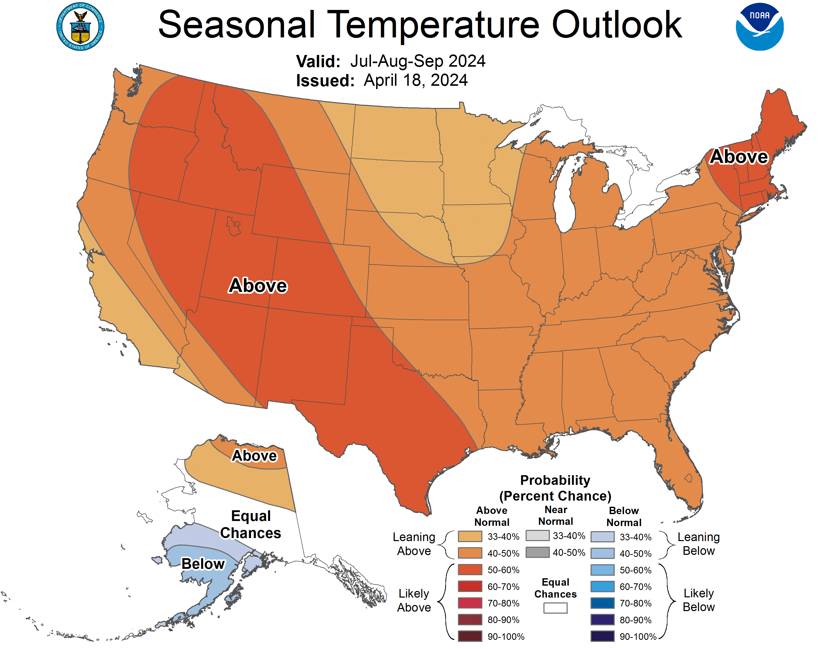
...three categories are defined from the 30 observations from 1981-2010. The coldest or driest 1/3 (10 years) define the B category, the warmest or wettest 1/3 (10 years) define the A category, and the remaining 10 years in between define the middle (N) category.
So the brown shading shows an increased probability of temperatures like the warmest 10 years of the past 30 years.
The darker brown is a 50% probability of those warmer temperatures.
White is equal probability of either warmer, average, or colder. There's no blue (below average) predictions for this year!
Here's the page with all the
future months thumbnail maps. It looks like a hotter and drier southwest, a hotter south and east coast, but with normal precipitation.
2.5 month lead time, 3 month
April-May-June temperature outlook: