Originally Posted by
crank_addict
I've been without a decent camera for nearly a year and have been just using whatever spec is on the cheap phone.
I have a digital camera that was fairly nice when I bought it (Canon PowerShot S2 IS). The phone I have now takes better pictures. My wife has a really good digital SLR, but I rarely bother using it. My photography skills don't surpass what I can do with the phone.
--------------
I think bikes look better with the chain on the big ring, but I don't see any reason to put it on the small cog. That doesn't look any better, and who are we kidding here? I use that combination to rule out chainring/cog wear when diagnosing mechanical problems.

I like to be able to see the stem shifters, and I usually choose the rear gear based on where it puts the shifter if the bike has stem shifters.
Aligning the valve stems is a nice touch, but I usually forget to do it.
The background shouldn't be too busy. A contrasting color is helpful, which I think usually makes garage doors tolerable. In the OP example the garage door doesn't contrast enough and the hardware creates too much noise.
I usually use a pedal against a curb to prop up the bike (when it isn't leaning against a garage door) so that limits my choice of crank orientation to something that doesn't look good. All else being equal, I like the cranks horizontal. Ideally it should be impossible to tell what is keeping the bike upright.
I don't care for the straight on angle. Especially with camera phone pictures it distorts the angles of the bike too much. For instance, in Bikerider007's picture in post 9 the seatstays and handlebars have the illusion of being turned away from the viewer. I often take pictures from a front angle in an effort to avoid this.
Offering a few examples of my own for critique...
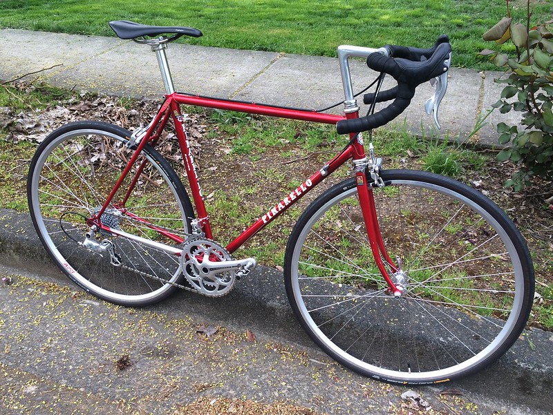
I think the "front angle" worked pretty well here. I'm looking down on the bike quite a bit. That's obvious not good, but I don't think it's awful. The alignment of the sidewalk and the top tube is less than ideal, but it's better than having them misaligned. The location of the sidewalk in this picture really exaggerates my already ridiculous stem height. The rear gear has the derailleur stretched out too much, and the rear wheel details are impossible to make out. The lighting was perfect to bring out the color of the frame, which is surprisingly difficult with this bike. I'd give this picture a C+.
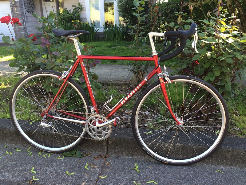
The "front angle" didn't work quite as well here. The handlebars and rear wheel appear to be facing different directions. The camera is lower to the ground, which I think looks a bit better. The sidewalk disappears in the center of the main triangle with some help from the rose bushes but is still in line with the top tube, so I think that's spot on. I like the way the roses work with the red in the bike. I wish more had been in bloom. The leaves around the saddle are a disaster, giving the illusion that the saddle is curled. The rear gear selection was even worse here. The overall picture is too dark, but I don't think I could fix that without washing out the color of the frame. I think this one is a low B.
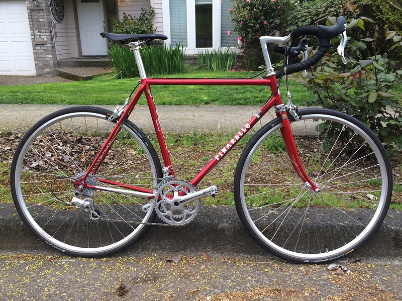
A straight-on shot...the parallax distortion is pretty bad here and made worse by the way the stem flows into the handlebar. The handlebars get lost in the dark area of the background foliage. The background in general just has too much going on. This picture is fairly bad, D-.
As a final note, I think a complementary set of detail pictures really enhances any bike photography.