Originally Posted by
Andy_K
That's another thing that Google shows me:
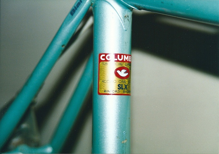
I don't know if that's original paint, but it's definitely not what I'm looking for. Prismatic Powders says the Pearled Turqoise is metallic, but it doesn't look that way in the swatch or any photo I've seen.
Metallic and pearl are really difficult to photograph unless the flakes are huge, or the the subject is close. They also excel under a clear, which adds needed depth. Someone said to keep looking at actual samples, and I'm going to echo that.
The human eye can differentiate more shades of green than any other color, which I don't think helps you here.
If you're looking for the bike to look "right" you should look at examples from the era it was built. You already know that Bianchi celeste is a moving target.