My takeaway is that Apple's information display philosophy doesn't support feeding data numbers in as 'granular' a fashion to their users as do other suppliers. Pretty much everything is shown as vertical line graphs displaying min/max values at intervals. When numbers are close that line appears as a dot, when there's a wider range the line is extended.
If you want numerical data, there's an Option feature (scroll down in Health) that provides a number with a time stamp in hours:minutes:seconds. An example from my trainer ride on Tuesday shows HR 130 @ 4:28:27 PM, with device as Apple Watch, date added to Health as 4:34:38 PM and 'context' as Sedentary -
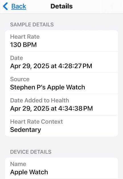
- which I find odd as that was just about the end of my trainer session.
The six minute delay in transmission I can't fathom when that same details page shows my TrackR's data at 4:49:04 PM: HR of 79 with Date Added just 2 seconds later at 4:49:06 with no 'context'.