


Bianchi logo
 02-23-26 | 11:43 PM
#1

Thread Starter
Slowfoot

Joined: Dec 2009
Posts: 148
Likes: 363
From: Reston, VA
Bikes: 1975 Raleigh International | 1979 Scapin | 1980 Trek 715 | 1984 SR Maxima | 1993 Bridgestone RB1 | 1996 Trek 5200 OCLV | 1998 753 Waterford X-12
Bianchi logo
I love this logo. What year did Bianchi stop using it?

 02-24-26 | 12:36 AM
#2
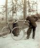


Are you referring to the down tube logo or to the head tube logo. The bike you highlight in the photo is from the early 60's.
02-24-26 | 02:12 AM
#3

Senior Member

Joined: Apr 2007
Posts: 12,567
Likes: 2,740
From: Thunder Bay, Ontario, Canada - burrrrr!
Bikes: 1958 Rabeneick 120D, 1968 Legnano Gran Premio, 196? Torpado Professional, 2000 Marinoni Piuma
When I owned this old Bianchi I did some research. As I recall, this livery came to an end in 1971 or 72. Trust me when I say that, at my age, my memory is not to be trusted.

__________________
"98% of the bikes I buy are projects".
"98% of the bikes I buy are projects".
02-24-26 | 02:15 AM
#4
Senior Member


Joined: Oct 2015
Posts: 16,181
Likes: 9,559
From: PDX
Bikes: Merz x 5 + Specialized Merz Allez x 2, Strawberry/Newlands/DiNucci/Ti x3, Gordon, Fuso/Moulton x2, Bornstein, Paisley,1958-74 Paramounts x3, 3rensho, 74 Moto TC, 73-78 Raleigh Pro's x5, Marinoni x2, 1960 Cinelli SC, 1980 Bianchi SC, PX-10 X 2
 02-24-26 | 07:57 AM
#5
Looks like a mishmash of decals from different eras on a late-'80's frame.
__________________
You are always the same age inside.---Gertrude Stein
My aluminum bikes: Light, strong, cheap, and comfy.
You are always the same age inside.---Gertrude Stein
My aluminum bikes: Light, strong, cheap, and comfy.
02-24-26 | 09:39 AM
#7
Senior Member
Joined: Oct 2015
Posts: 16,181
Likes: 9,559
From: PDX
Bikes: Merz x 5 + Specialized Merz Allez x 2, Strawberry/Newlands/DiNucci/Ti x3, Gordon, Fuso/Moulton x2, Bornstein, Paisley,1958-74 Paramounts x3, 3rensho, 74 Moto TC, 73-78 Raleigh Pro's x5, Marinoni x2, 1960 Cinelli SC, 1980 Bianchi SC, PX-10 X 2
02-24-26 | 10:41 AM
#8

Senior Member

Joined: Jun 2006
Posts: 12,914
Likes: 5,479
From: NW Burbs, Chicago
Randy's and merziac's bikes are the lower-mid end model called the Record. If you notice, the kerning is much larger than the kerning of the logo of what the OP posted. So not exactly the same. But the Nicolis Museum has what they call a 1970 Bianchi with the tight-kerning logo like in the OP. Speed Bicycles has a 1973 Bianchi with a "new" logo.
Of course this is limited to their corsa bikes. Their city bikes continued with the "old" logo.
Of course this is limited to their corsa bikes. Their city bikes continued with the "old" logo.
02-24-26 | 10:53 AM
#10

Bike Butcher of Portland
Joined: Jul 2014
Posts: 12,487
Likes: 8,057
From: Portland, OR
Bikes: It's complicated.
__________________
If someone tells you that you have enough bicycles and you don't need any more, stop talking to them. You don't need that kind of negativity in your life.
If someone tells you that you have enough bicycles and you don't need any more, stop talking to them. You don't need that kind of negativity in your life.
02-24-26 | 11:29 AM
#11
Senior Member

Joined: Dec 2020
Posts: 7,002
Likes: 3,850
From: Wake Forest, NC
Bikes: 1989 Cinelli Supercorsa
02-24-26 | 12:20 PM
#13

No, I went to school to learn this cr_p and we were taught that the terminology is:
the LOGOTYPE is comprised of a word or words (real or imaginary) with "distinctive treatment" which makes it unique and therefore can be copyrighted as intellectual property.
This Logotype CAN by accompanied by a symbolic representation which is known as the MARK and the relationship of this MARK (combined WITH as well as displayed STAND-ALONE so WITHOUT) the LOGOTYPE (which also can be displayed as STAND-ALONE) is to be carefully managed by the Design Team by means of the CORPORATE IDENTITY MANUAL which will specify all parameters (size, colors, backgrounds, Dos and Don'ts) for every possible use of this IDENTITY in every imaginable variation
for which the Design Team will charge the CLIENT a nose-bleedingly exorbitant FEE (and not one penny LESS) which will cause the CLIENT to lose their SH_T!

"Logo" is an abbreviated idiomatic expression used informally by the General Public so can be used to describe whatever they want, but if you tried that in Design School...

and don't get me starting on what is meant by "Kerning" versus "Letter-Spacing" or for that matter "Word-Spacing", "Leading" and "Ligatures"...this will all be covered in next semesters lecture series in which we concentrate on TYPOGRAPHY, so don't jump ahead!

oh hang on! I just now remember a term that came into common usage way after I left the Design School "dogmatism" which is:
namely the "Lock-up".
It was how we came to describe a "mark plus logotype" that was "locked" and never to be rent asunder till Death do they Part, unless the Corporate Identity Manual said it's okay.
Just shows to go ya that language, including jargon, can change over time.
the LOGOTYPE is comprised of a word or words (real or imaginary) with "distinctive treatment" which makes it unique and therefore can be copyrighted as intellectual property.
This Logotype CAN by accompanied by a symbolic representation which is known as the MARK and the relationship of this MARK (combined WITH as well as displayed STAND-ALONE so WITHOUT) the LOGOTYPE (which also can be displayed as STAND-ALONE) is to be carefully managed by the Design Team by means of the CORPORATE IDENTITY MANUAL which will specify all parameters (size, colors, backgrounds, Dos and Don'ts) for every possible use of this IDENTITY in every imaginable variation
for which the Design Team will charge the CLIENT a nose-bleedingly exorbitant FEE (and not one penny LESS) which will cause the CLIENT to lose their SH_T!
"Logo" is an abbreviated idiomatic expression used informally by the General Public so can be used to describe whatever they want, but if you tried that in Design School...
and don't get me starting on what is meant by "Kerning" versus "Letter-Spacing" or for that matter "Word-Spacing", "Leading" and "Ligatures"...this will all be covered in next semesters lecture series in which we concentrate on TYPOGRAPHY, so don't jump ahead!
oh hang on! I just now remember a term that came into common usage way after I left the Design School "dogmatism" which is:
namely the "Lock-up".
It was how we came to describe a "mark plus logotype" that was "locked" and never to be rent asunder till Death do they Part, unless the Corporate Identity Manual said it's okay.
Just shows to go ya that language, including jargon, can change over time.
Last edited by unworthy1; 02-24-26 at 08:46 PM.
02-24-26 | 12:48 PM
#14
Senior Member
Joined: Jun 2006
Posts: 12,914
Likes: 5,479
From: NW Burbs, Chicago
02-24-26 | 01:29 PM
#15
Senior Member
Joined: Oct 2015
Posts: 16,181
Likes: 9,559
From: PDX
Bikes: Merz x 5 + Specialized Merz Allez x 2, Strawberry/Newlands/DiNucci/Ti x3, Gordon, Fuso/Moulton x2, Bornstein, Paisley,1958-74 Paramounts x3, 3rensho, 74 Moto TC, 73-78 Raleigh Pro's x5, Marinoni x2, 1960 Cinelli SC, 1980 Bianchi SC, PX-10 X 2
This has the "intergrated" HS so goes back a ways like the one Randy shared.
Here's an original from when those decals were in use, the tubing decal, upper DT may or may not be correct on the other and the Campy always is regardless of flavor IMO.

I'm good so long as folks don't go the other way with newer on older unless its a very well done "retro, resto mod thing" of some sort that just works well which is always very subjective in the eye of the beholder.
 03-08-26 | 08:11 AM
#17

Bianchi Goddess
Joined: Apr 2009
Posts: 28,967
Likes: 4,236
From: Shady Pines Retirement Fort Wayne, In
Bikes: Too many to list here check my signature.
__________________
�One morning you wake up, the girl is gone, the bikes are gone, all that's left behind is a pair of old tires and a tube of tubular glue, all squeezed out"
Sugar "Kane" Kowalczyk
�One morning you wake up, the girl is gone, the bikes are gone, all that's left behind is a pair of old tires and a tube of tubular glue, all squeezed out"
Sugar "Kane" Kowalczyk
03-08-26 | 01:32 PM
#18
Senior Member
Joined: Oct 2015
Posts: 16,181
Likes: 9,559
From: PDX
Bikes: Merz x 5 + Specialized Merz Allez x 2, Strawberry/Newlands/DiNucci/Ti x3, Gordon, Fuso/Moulton x2, Bornstein, Paisley,1958-74 Paramounts x3, 3rensho, 74 Moto TC, 73-78 Raleigh Pro's x5, Marinoni x2, 1960 Cinelli SC, 1980 Bianchi SC, PX-10 X 2
