


Modern Bikes vs. Personal Taste
 06-01-11, 02:06 PM
#51

Dropped


 06-01-11, 06:22 PM
#52
Senior Member
Join Date: Mar 2007
Location: Saskatchewan
Posts: 2,465
Mentioned: 0 Post(s)
Tagged: 0 Thread(s)
Quoted: 3 Post(s)
Likes: 0
Liked 6 Times
in
5 Posts
Here's what I don't understand: I thought the sloping top tube was designed to get the bars higher. Yet I look at the Specialized and the bars are no higher than if the top tube was level. Seems frame should be bigger. And the foot of seatpost just looks awkward to me.
Its really about making 3 frames sizes rather than 6.
Do you have any trouble climbing on and off the Maronni?
The increased length and leverage of the seatpost can't be an effective design decision.
Its really about making 3 frames sizes rather than 6.
Do you have any trouble climbing on and off the Maronni?
The increased length and leverage of the seatpost can't be an effective design decision.
I have no trouble getting off and on the Marinoni. I have a 33 1/2 inseam.
The seat post stem on the Roubaix can't really be seen in the pic.
I don't know if that long carbon post with its gel insert does anything but maybe that's why it reduces the noise through the seat? The difference in noise through the bars is very much noticed riding these back to back.
I'm no faster on the Specialized, but I can ride a lot farther in greater comfort.
And when you hit the big 4-0 comfort=speed in some cases.
06-01-11, 06:29 PM
#53
Banned.
Join Date: Dec 2007
Posts: 27,199
Mentioned: 34 Post(s)
Tagged: 1 Thread(s)
Quoted: 378 Post(s)
Liked 1,409 Times
in
909 Posts
Well, this is NASCAR country, so I can't say I hate the new graphics....But it would be nice to see Junior in an all-red car with chrome rims and bumpers....
Maybe we should have a thread with monologues like Costner's in Bull Durham, about bikes....
Maybe we should have a thread with monologues like Costner's in Bull Durham, about bikes....
06-01-11, 07:35 PM
#55
Chrome Freak

Join Date: Dec 2005
Location: Kuna, ID
Posts: 3,208
Bikes: 71 Chrome Paramount P13-9, 73 Opaque Blue Paramount P15, 74 Blue Mink Raleigh Pro, 91 Waterford Paramount, Holland Titanium x2
Mentioned: 1 Post(s)
Tagged: 0 Thread(s)
Quoted: 4 Post(s)
Likes: 0
Liked 26 Times
in
14 Posts
I like them both, my "modern" bike is an 06 Specialized Sequoia Elite. I like that it isn't overloaded with graphics and is painted a dull stealth silver gray. I think my classics are better looking, but I like the variety when it comes to riding.
__________________
1971 Paramount P-13 Chrome
1973 Paramount P-15 Opaque Blue
1974 Raleigh Professional Blue Mink
1991 Waterford Paramount
Holland Titanium Dura Ace Group
Holland Titanium Ultegra Triple Group
1971 Paramount P-13 Chrome
1973 Paramount P-15 Opaque Blue
1974 Raleigh Professional Blue Mink
1991 Waterford Paramount
Holland Titanium Dura Ace Group
Holland Titanium Ultegra Triple Group
06-01-11, 07:41 PM
#56
"Chooch"

Join Date: Jun 2010
Location: Prairieville, Louisiana
Posts: 1,659
Bikes: Late 1990s Ciocc Titan
Mentioned: 0 Post(s)
Tagged: 0 Thread(s)
Quoted: 1 Post(s)
Likes: 0
Liked 2 Times
in
2 Posts
I admit that I find that - in terms of appearance - contemporary CF and aluminum frame bikes disturbingly remind me of some of the early 1970s department-store trashmo "10-speeds". There's something about the elegance - and superior ride qualities - of a fine, lightweight, traditionally-built lugged-steel frame that the modern made-from-a-mold CF frames simply can't match IMHO.
 06-02-11, 05:07 AM
#58
Motorcycle RoadRacer

Join Date: May 2010
Posts: 3,826
Mentioned: 5 Post(s)
Tagged: 0 Thread(s)
Quoted: 3 Post(s)
Likes: 0
Liked 4 Times
in
4 Posts
I really don't mean to come across as a "hater", but personally, I find a lot of today's modern bikes to be absolutely hideous.
Fat cranks, what look like oversize stemsets, and mostly, those horrendous paint and graphic schemes. My personal tastes run, of course, to the older classic streamlined look.
Just one man's opinion, FWIW.
Fat cranks, what look like oversize stemsets, and mostly, those horrendous paint and graphic schemes. My personal tastes run, of course, to the older classic streamlined look.
Just one man's opinion, FWIW.
Ditto, I feel the same way about cars too...

Good post, and dam good point!!
 06-02-11, 05:18 AM
#59
people's champ

Join Date: Oct 2010
Location: joisey
Posts: 1,517
Mentioned: 0 Post(s)
Tagged: 0 Thread(s)
Quoted: 1 Post(s)
Likes: 0
Liked 3 Times
in
2 Posts
to go one further - i find that the most interesting color schemes / designs are from the ultra cheesey dept store 10 speed bikes of the 70s and 80s
i agree todays high end CF offerings are boring to look at - though some of the newer steel still has the classic appeal
i agree todays high end CF offerings are boring to look at - though some of the newer steel still has the classic appeal
06-02-11, 05:34 AM
#60
Senior Member
Join Date: Apr 2010
Location: Forked River, NJ
Posts: 694
Bikes: 1973 Peugeot UE-8, 1985 Schwinn Voyageur, 2010 Trek 1.2, 2012 Bianchi Siempre
Mentioned: 0 Post(s)
Tagged: 0 Thread(s)
Quoted: 0 Post(s)
Likes: 0
Liked 0 Times
in
0 Posts
Y'all realize that in another 25 years, our grandkids will be reminiscing over carbon fiber bikes in the Classic and Vintage section, and we'll be posting in the newly created Ancients and Antiques section. 
06-02-11, 06:21 AM
#61
Chainstay Brake Mafia
Join Date: Mar 2011
Location: California
Posts: 6,007
Mentioned: 5 Post(s)
Tagged: 0 Thread(s)
Quoted: 16 Post(s)
Likes: 0
Liked 11 Times
in
10 Posts
i took a look at bikes direct to get an idea of modern bikes
main thing i notice is: boring colors and paint schemes. all the logos use similar typefaces which are intended to be easily read from a distance
after that, the brifter bump is fugly, especially with the new style squashed looking handlebars, where the brifters stick straight out. threadless headset/stems are big and bulky
other things: wheel graphics and logos are hideous! forks have very little rake. cranksets are big and bulk looking. no polished, shiny bits.. everything is blacked out. carbon and aluminum frames look kind of plasticy and cheap
there are some nicer looking bikes on that site though
one other thing i don't like about modern bikes: their prices I was able to build up my Ironman for about $100 all said and done.. I've never ridden a modern bike but I'd have a hard time believing a $2000 bike is 20 times "better"
main thing i notice is: boring colors and paint schemes. all the logos use similar typefaces which are intended to be easily read from a distance
after that, the brifter bump is fugly, especially with the new style squashed looking handlebars, where the brifters stick straight out. threadless headset/stems are big and bulky
other things: wheel graphics and logos are hideous! forks have very little rake. cranksets are big and bulk looking. no polished, shiny bits.. everything is blacked out. carbon and aluminum frames look kind of plasticy and cheap
there are some nicer looking bikes on that site though
one other thing i don't like about modern bikes: their prices
I was able to build up my Ironman for about $100 all said and done.. I've never ridden a modern bike but I'd have a hard time believing a $2000 bike is 20 times "better"
06-02-11, 06:29 AM
#62
Senior Member
Join Date: Apr 2010
Location: Forked River, NJ
Posts: 694
Bikes: 1973 Peugeot UE-8, 1985 Schwinn Voyageur, 2010 Trek 1.2, 2012 Bianchi Siempre
Mentioned: 0 Post(s)
Tagged: 0 Thread(s)
Quoted: 0 Post(s)
Likes: 0
Liked 0 Times
in
0 Posts
Bikesdirect are designed to be graphically boring. Simple painting with simple decals is one way they keep their prices down. Its also how they can rotate their frames among different "models".
06-02-11, 06:37 AM
#63
Senior Member
 06-02-11, 06:41 AM
#64
Bicycle Repairman
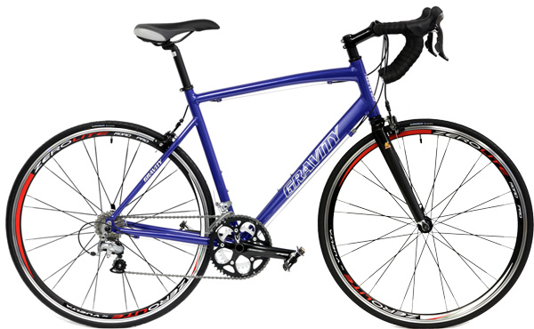
However - At the risk of coming across as a hypocrite, I do like this bike:
.jpg)
This thing is so incredibly ugly it's cool!

I wonder if I could get one that's purple...
")
 06-02-11, 10:53 AM
#66
Senior Member

Join Date: May 2008
Location: North, Ga.
Posts: 2,401
Bikes: 3Rensho-Aerodynamics, Bernard Hinault Look - 1986 tour winner, Guerciotti, Various Klein's & Panasonic's
Mentioned: 5 Post(s)
Tagged: 0 Thread(s)
Quoted: 159 Post(s)
Liked 375 Times
in
162 Posts
I think my Klein looks nice for a newer bike. It's a 2003 model, so not so new.
06-02-11, 11:48 AM
#67
Curmudgeon in Training

Join Date: May 2009
Location: Rural Retreat, VA
Posts: 1,956
Bikes: 1974 Gazelle Champion Mondial, 2010 Cannondale Trail SL, 1988 Peugeot Nice, 1992ish Stumpjumper Comp,1990's Schwinn Moab
Mentioned: 1 Post(s)
Tagged: 0 Thread(s)
Quoted: 19 Post(s)
Likes: 0
Liked 9 Times
in
8 Posts
I don't see how anyone could think that's ugly. 
It even has lugs. I want one with SRAM Yellow on it. They offer SRAM Red, i'm sure I could talk them into the yellow. Better be able to for the 14k price tag.
It even has lugs. I want one with SRAM Yellow on it. They offer SRAM Red, i'm sure I could talk them into the yellow. Better be able to for the 14k price tag.
06-02-11, 11:52 AM
#68
Senior Member
Join Date: Apr 2010
Location: Forked River, NJ
Posts: 694
Bikes: 1973 Peugeot UE-8, 1985 Schwinn Voyageur, 2010 Trek 1.2, 2012 Bianchi Siempre
Mentioned: 0 Post(s)
Tagged: 0 Thread(s)
Quoted: 0 Post(s)
Likes: 0
Liked 0 Times
in
0 Posts
^^^ Pretty sure if I tried to ride that, you'd need to call a chiropractor afterward.
06-02-11, 11:52 AM
#69

Senior Member
i took a look at bikes direct to get an idea of modern bikes
main thing i notice is: boring colors and paint schemes. all the logos use similar typefaces which are intended to be easily read from a distance
after that, the brifter bump is fugly, especially with the new style squashed looking handlebars, where the brifters stick straight out. threadless headset/stems are big and bulky
other things: wheel graphics and logos are hideous! forks have very little rake. cranksets are big and bulk looking. no polished, shiny bits.. everything is blacked out. carbon and aluminum frames look kind of plasticy and cheap
there are some nicer looking bikes on that site though
one other thing i don't like about modern bikes: their prices I was able to build up my Ironman for about $100 all said and done.. I've never ridden a modern bike but I'd have a hard time believing a $2000 bike is 20 times "better"
main thing i notice is: boring colors and paint schemes. all the logos use similar typefaces which are intended to be easily read from a distance
after that, the brifter bump is fugly, especially with the new style squashed looking handlebars, where the brifters stick straight out. threadless headset/stems are big and bulky
other things: wheel graphics and logos are hideous! forks have very little rake. cranksets are big and bulk looking. no polished, shiny bits.. everything is blacked out. carbon and aluminum frames look kind of plasticy and cheap
there are some nicer looking bikes on that site though
one other thing i don't like about modern bikes: their prices
I was able to build up my Ironman for about $100 all said and done.. I've never ridden a modern bike but I'd have a hard time believing a $2000 bike is 20 times "better"
06-02-11, 12:27 PM
#70
Senior Member

Join Date: Nov 2007
Location: Santa Fe, NM
Posts: 4,599
Bikes: Vassago Moosknuckle Ti 29+ XTR, 90's Merckx Corsa-01 9sp Record, PROJECT: 1954 Frejus SuperCorsa
Mentioned: 11 Post(s)
Tagged: 0 Thread(s)
Quoted: 174 Post(s)
Liked 157 Times
in
75 Posts

SRAM would be nice. Me? I'd go with Super Record 11sp on that machine.
06-02-11, 12:32 PM
#71
Senior Member
Join Date: Jul 2009
Posts: 11,128
Bikes: 1986 Alan Record Carbonio, 1985 Vitus Plus Carbone 7, 1984 Peugeot PSV, 1972 Line Seeker, 1986(est.) Medici Aerodynamic (Project), 1985(est.) Peugeot PY10FC
Mentioned: 22 Post(s)
Tagged: 0 Thread(s)
Quoted: 150 Post(s)
Likes: 0
Liked 34 Times
in
27 Posts
Bicycles seem to have seemed to have undergone similar fates aesthetically as GP F1cars did from the 80's to the present.
Just compare an 80's/early 90s Ferrari GP F1 race car to the monsterous looking things they drive today and you will see the way technology whacked them with the "ugly stick" through the years, just as much as it did with bicycles.
Chombi
Just compare an 80's/early 90s Ferrari GP F1 race car to the monsterous looking things they drive today and you will see the way technology whacked them with the "ugly stick" through the years, just as much as it did with bicycles.
Chombi
06-02-11, 12:41 PM
#73
Senior Member

Join Date: Dec 2010
Location: Detroit, MI
Posts: 216
Bikes: 1973 Schwinn Collegiate, 1983 Fuji Royale II Mixte
Mentioned: 0 Post(s)
Tagged: 0 Thread(s)
Quoted: 0 Post(s)
Likes: 0
Liked 0 Times
in
0 Posts
Meh. I just think those bubbly welds are really ugly. But I'm also an artist that does a lot of miniature trained to pay attention to minute detail. I don't even like a little bit of leaked glue. To me the welded frames on mid-range mass produced bikes say "Look! No one cared about me looking good! I am not unique at all!"
06-02-11, 01:55 PM
#74
Old fart

Join Date: Nov 2004
Location: Appleton WI
Posts: 24,786
Bikes: Several, mostly not name brands.
Mentioned: 153 Post(s)
Tagged: 0 Thread(s)
Quoted: 3588 Post(s)
Liked 3,400 Times
in
1,934 Posts
Not trying to make this personal but if you don't care about racing or performance for whatever reason that's fine, but it doesn't make stiffness a 'fashion issue'. You obviously haven't listened to interviews with veteran pros talking about vintage versus modern bikes, they invariably cite frame stiffness as a performance improvement.
Seems like there are a lot of slow old dudes on this forum that simply can't (or refuse to) appreciate the performance of modern bikes
Seems like there are a lot of slow old dudes on this forum that simply can't (or refuse to) appreciate the performance of modern bikes
06-02-11, 01:59 PM
#75
Senior Member
Join Date: Nov 2010
Posts: 3,504
Mentioned: 9 Post(s)
Tagged: 0 Thread(s)
Quoted: 586 Post(s)
Liked 612 Times
in
447 Posts
Guess I'll chime in with the rest of 'ya. I like old bikes, I like new bikes and I like in-between bikes. I like bikes. Prefer older bikes, but don't turn up my nose at new ones.