


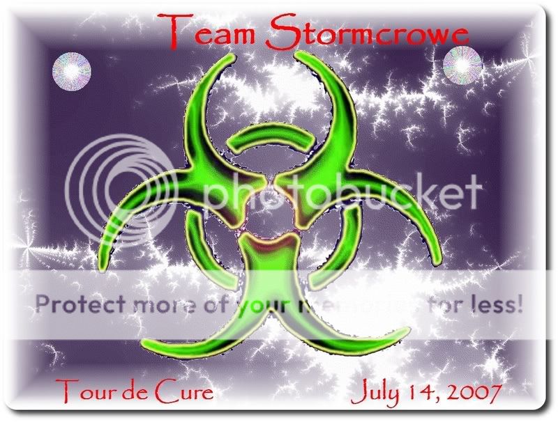
I need some opinions on this graphic from fellow Clydes!
 03-18-07, 08:30 AM
#1


Out fishing with Annie on his lap, a cigar in one hand and a ginger ale in the other, watching the sunset.
Thread Starter

Join Date: Mar 2006
Location: South Florida
Posts: 16,056
Bikes: Techna Wheelchair and a Sun EZ 3 Recumbent Trike
Mentioned: 3 Post(s)
Tagged: 0 Thread(s)
Quoted: 9 Post(s)
Likes: 0
Liked 22 Times
in
17 Posts
I need some opinions on this graphic from fellow Clydes!
This is for the Tour de Cure shirts for my TdC team and later use touring, etc!
__________________
. �He who fights with monsters might take care lest he thereby become a monster. And if you gaze for long into an abyss, the abyss gazes also into you.�- Fredrick Nietzsche
"We can judge the heart of a man by his treatment of animals." - Immanuel Kant
. �He who fights with monsters might take care lest he thereby become a monster. And if you gaze for long into an abyss, the abyss gazes also into you.�- Fredrick Nietzsche
"We can judge the heart of a man by his treatment of animals." - Immanuel Kant
 03-18-07, 09:09 AM
#2

fishologist
Join Date: May 2006
Location: Pacific Northwest
Posts: 1,199
Bikes: Diamondback MTB; Leader 736R
Mentioned: 0 Post(s)
Tagged: 0 Thread(s)
Quoted: 0 Post(s)
Likes: 0
Liked 0 Times
in
0 Posts
I like it..isn't there a screen saver that looks like that?
__________________
We cannot solve problems with the same level of consciousness that created them. A.E.
1990 Diamond Back MTB
2007 Leader 736R
www.cohocyclist.blogspot.com
https://www.loopd.com/members/cohocyclist/Default.aspx

We cannot solve problems with the same level of consciousness that created them. A.E.
1990 Diamond Back MTB
2007 Leader 736R
www.cohocyclist.blogspot.com
https://www.loopd.com/members/cohocyclist/Default.aspx
03-18-07, 09:22 AM
#3
Senior Curmudgeon

Join Date: Jan 2005
Location: Directly above the center of the earth
Posts: 3,856
Bikes: Varies by day
Mentioned: 0 Post(s)
Tagged: 0 Thread(s)
Quoted: 5 Post(s)
Likes: 0
Liked 2 Times
in
1 Post
In my humble opinion, somewhat "busy" for a logo. Logos normally have to "scale" from small to large depending on where they're used. If yours is reduced much, the extra detail will be lost and the logo will look "dirty." Consider throwing out extraneous elements and simplifying shapes where possible. At the size and colors you've displayed on the screen, it looks fine, though.
__________________
Nishiki road bike, Raleigh road bike, Electra Cruiser Lux 7d, Electra Townie 3i, Electra Townie 1, Whatever I find today!
03-18-07, 11:55 AM
#4
Out fishing with Annie on his lap, a cigar in one hand and a ginger ale in the other, watching the sunset.
Thread Starter
Join Date: Mar 2006
Location: South Florida
Posts: 16,056
Bikes: Techna Wheelchair and a Sun EZ 3 Recumbent Trike
Mentioned: 3 Post(s)
Tagged: 0 Thread(s)
Quoted: 9 Post(s)
Likes: 0
Liked 22 Times
in
17 Posts
Originally Posted by FarHorizon
In my humble opinion, somewhat "busy" for a logo. Logos normally have to "scale" from small to large depending on where they're used. If yours is reduced much, the extra detail will be lost and the logo will look "dirty." Consider throwing out extraneous elements and simplifying shapes where possible. At the size and colors you've displayed on the screen, it looks fine, though.
__________________
. �He who fights with monsters might take care lest he thereby become a monster. And if you gaze for long into an abyss, the abyss gazes also into you.�- Fredrick Nietzsche
"We can judge the heart of a man by his treatment of animals." - Immanuel Kant
. �He who fights with monsters might take care lest he thereby become a monster. And if you gaze for long into an abyss, the abyss gazes also into you.�- Fredrick Nietzsche
"We can judge the heart of a man by his treatment of animals." - Immanuel Kant
03-19-07, 10:48 AM
#5
SERENITY NOW!!!

Join Date: Aug 2005
Location: In the 212
Posts: 8,738
Bikes: Haro Vector, IRO Rob Roy, Bianchi Veloce
Mentioned: 0 Post(s)
Tagged: 0 Thread(s)
Quoted: 4 Post(s)
Likes: 0
Liked 1 Time
in
1 Post
Isn't that a biohazard symbol?
__________________
HHCMF - Take pride in your ability to amaze lesser mortals! - MikeR


We demand rigidly defined areas of doubt and uncertainty!
HHCMF - Take pride in your ability to amaze lesser mortals! - MikeR
We demand rigidly defined areas of doubt and uncertainty!
03-19-07, 10:51 AM
#6
Out fishing with Annie on his lap, a cigar in one hand and a ginger ale in the other, watching the sunset.
Thread Starter
Join Date: Mar 2006
Location: South Florida
Posts: 16,056
Bikes: Techna Wheelchair and a Sun EZ 3 Recumbent Trike
Mentioned: 3 Post(s)
Tagged: 0 Thread(s)
Quoted: 9 Post(s)
Likes: 0
Liked 22 Times
in
17 Posts
Originally Posted by jyossarian
Isn't that a biohazard symbol?

__________________
. �He who fights with monsters might take care lest he thereby become a monster. And if you gaze for long into an abyss, the abyss gazes also into you.�- Fredrick Nietzsche
"We can judge the heart of a man by his treatment of animals." - Immanuel Kant
. �He who fights with monsters might take care lest he thereby become a monster. And if you gaze for long into an abyss, the abyss gazes also into you.�- Fredrick Nietzsche
"We can judge the heart of a man by his treatment of animals." - Immanuel Kant
03-19-07, 11:05 AM
#7
Fat yet photogenic

Join Date: Mar 2007
Location: Switzerland
Posts: 108
Bikes: GT avalanche 1.0 disc
Mentioned: 0 Post(s)
Tagged: 0 Thread(s)
Quoted: 0 Post(s)
Likes: 0
Liked 0 Times
in
0 Posts
Now that is funny - in my gutter like mind anyway - that never left the back of the school bus humour mode.
Are you going to get bikejerseys to print them graphic for $105 per top ?
Are you going to get bikejerseys to print them graphic for $105 per top ?
03-19-07, 11:11 AM
#8
Out fishing with Annie on his lap, a cigar in one hand and a ginger ale in the other, watching the sunset.
Thread Starter
Join Date: Mar 2006
Location: South Florida
Posts: 16,056
Bikes: Techna Wheelchair and a Sun EZ 3 Recumbent Trike
Mentioned: 3 Post(s)
Tagged: 0 Thread(s)
Quoted: 9 Post(s)
Likes: 0
Liked 22 Times
in
17 Posts
Originally Posted by obelix67
Now that is funny - in my gutter like mind anyway - that never left the back of the school bus humour mode.
Are you going to get bikejerseys to print them graphic for $105 per top ?
Are you going to get bikejerseys to print them graphic for $105 per top ?

Ideally, I'd like to do a full sublimation jersey design, but that's extremely pricey!

__________________
. �He who fights with monsters might take care lest he thereby become a monster. And if you gaze for long into an abyss, the abyss gazes also into you.�- Fredrick Nietzsche
"We can judge the heart of a man by his treatment of animals." - Immanuel Kant
. �He who fights with monsters might take care lest he thereby become a monster. And if you gaze for long into an abyss, the abyss gazes also into you.�- Fredrick Nietzsche
"We can judge the heart of a man by his treatment of animals." - Immanuel Kant
03-19-07, 06:45 PM
#9
Geezer Member

Join Date: Sep 2003
Location: Cedar Rapids, IA
Posts: 1,384
Bikes: Airborne, LeMond, Bianchi CX, Volae Century, Redline 925 (fixed) and a Burley Tandem.
Mentioned: 0 Post(s)
Tagged: 0 Thread(s)
Quoted: 0 Post(s)
Likes: 0
Liked 0 Times
in
0 Posts
Originally Posted by jyossarian
Isn't that a biohazard symbol?
__________________
Carpe who?
Carpe who?
03-19-07, 06:49 PM
#10
Out fishing with Annie on his lap, a cigar in one hand and a ginger ale in the other, watching the sunset.
Thread Starter
Join Date: Mar 2006
Location: South Florida
Posts: 16,056
Bikes: Techna Wheelchair and a Sun EZ 3 Recumbent Trike
Mentioned: 3 Post(s)
Tagged: 0 Thread(s)
Quoted: 9 Post(s)
Likes: 0
Liked 22 Times
in
17 Posts
Originally Posted by Grampy�
This was my first impression also.....

__________________
. �He who fights with monsters might take care lest he thereby become a monster. And if you gaze for long into an abyss, the abyss gazes also into you.�- Fredrick Nietzsche
"We can judge the heart of a man by his treatment of animals." - Immanuel Kant
. �He who fights with monsters might take care lest he thereby become a monster. And if you gaze for long into an abyss, the abyss gazes also into you.�- Fredrick Nietzsche
"We can judge the heart of a man by his treatment of animals." - Immanuel Kant
03-19-07, 09:40 PM
#12
Out fishing with Annie on his lap, a cigar in one hand and a ginger ale in the other, watching the sunset.
Thread Starter
Join Date: Mar 2006
Location: South Florida
Posts: 16,056
Bikes: Techna Wheelchair and a Sun EZ 3 Recumbent Trike
Mentioned: 3 Post(s)
Tagged: 0 Thread(s)
Quoted: 9 Post(s)
Likes: 0
Liked 22 Times
in
17 Posts
Originally Posted by smittyben
i love when people start in the middle of a thread
i hope you don't mind me asking(i'll probably get a bunch of s*** for this) What is the Tour de Cure trying to cure
i hope you don't mind me asking(i'll probably get a bunch of s*** for this) What is the Tour de Cure trying to cure
It's an official event for the American Diabetes Association. Click the link in my sig line for Tour de Cure and see my personal Page.
or here: https://main.diabetes.org/site/TR?pg=...373&px=3127592
__________________
. �He who fights with monsters might take care lest he thereby become a monster. And if you gaze for long into an abyss, the abyss gazes also into you.�- Fredrick Nietzsche
"We can judge the heart of a man by his treatment of animals." - Immanuel Kant
. �He who fights with monsters might take care lest he thereby become a monster. And if you gaze for long into an abyss, the abyss gazes also into you.�- Fredrick Nietzsche
"We can judge the heart of a man by his treatment of animals." - Immanuel Kant
03-21-07, 08:55 AM
#13
Clyde Rider/Racer
Join Date: Jan 2007
Location: Kansas City
Posts: 58
Bikes: Surly CrossXCheck & Cannondale F3000
Mentioned: 0 Post(s)
Tagged: 0 Thread(s)
Quoted: 0 Post(s)
Likes: 0
Liked 0 Times
in
0 Posts
Originally Posted by Tom Stormcrowe
This is for the Tour de Cure shirts for my TdC team and later use touring, etc!
Hi Tom, I don't know what sort of time frame you're needing to work in with regards to jersey production/screening/etc. but I've been an Art Director/Design Director for over ten years now for various agencies and publishing companies, etc. I can give you a hand with this if you'd like...
Some thoughts if you were one of my designers bringing this to me...and PLEASE take no offense to any of this, this just happens to be what I do and you asked...here we go;
First off, is that the bio-hazard logo, yep! Okay I understand it's an inside joke and that's cool but I might suggest picking or developing another iconic treatment if you're hoping to sell to people outside "the know" of the joke - it's not bad, i get it but many wouldn't understand or be able to put together a visual connection. The font you chose looks like a font called "Papyrus", it's a beautiful font but not the most visually stimulating or complimentary font choice when the biohazard icon is sharring space in the design...In good design you think of how a font compliments the whole rather than a personal like or dislike of a font. Like if you had a picture of a samuri swinging a sword, one shouldn't use an old-west looking cowboy font saying "SAMURI" underneath, well you're in that similar boat with a recognized hazardous waste icon in the same space with a font best used for biblical periodicals.
It seems that you're just going with the computer programs kerning default (the space between leters) and in most cases the default is pretty standard and looks okay until you get into something like the letter "T" - the space between the T and the next letter has some of your words looking askew, for example "Tom" and "Tour" look a bit like the read, "T om" and "T our" - I understand we're not all professionally trained typographers but I just want you to have the best looking product.
The background I can't comment too much on because honestly, I'm not sure what it is, it reminds me of the way a window looks on a biterly cold morning and ice crystals have formed in the corner of the glass and lastly the color choices could all compliment one another a bit better.
Now it's one thing to be an armchair shirt designer but a couple closing thoughts, I'd be ABSOLUTELY more than happy to get this together for you really tight and professional and can recreate your idea but in ways that better visually communicate your name and messege. And/or I think you should consider a play off your name, you have this really cool name STORMCROWE that alone conjurs up all sorts of imagery...say some neat retro looking black bird (Heckyl and Jeckyl-esque) riding a mountain bike past a corn field, storm brewing in the background and in the middleground is a scarecrow in the field but the clothes hanging off the scarecrow would be your old fat pants and shirt from the pic I've seen (like your normal scarecrow look but he's draped in like 8xl apparel), it's your little visual play/tribute to your success in getting your life back through incredible weight loss....that was just a quick idea.
But again Tom, I'd be happy to help you make anything happen and it would cost you no more than a thank you and jersey in the end...obviouly that's fairly substantial if you're talking about $105 jerseys...hahahhahaha ouch!
Hope this was of some help.
Clint
03-21-07, 09:49 AM
#14
Out fishing with Annie on his lap, a cigar in one hand and a ginger ale in the other, watching the sunset.
Thread Starter
Join Date: Mar 2006
Location: South Florida
Posts: 16,056
Bikes: Techna Wheelchair and a Sun EZ 3 Recumbent Trike
Mentioned: 3 Post(s)
Tagged: 0 Thread(s)
Quoted: 9 Post(s)
Likes: 0
Liked 22 Times
in
17 Posts
Originally Posted by The CLYDE
Hi Tom, I don't know what sort of time frame you're needing to work in with regards to jersey production/screening/etc. but I've been an Art Director/Design Director for over ten years now for various agencies and publishing companies, etc. I can give you a hand with this if you'd like...
Some thoughts if you were one of my designers bringing this to me...and PLEASE take no offense to any of this, this just happens to be what I do and you asked...here we go;
First off, is that the bio-hazard logo, yep! Okay I understand it's an inside joke and that's cool but I might suggest picking or developing another iconic treatment if you're hoping to sell to people outside "the know" of the joke - it's not bad, i get it but many wouldn't understand or be able to put together a visual connection. The font you chose looks like a font called "Papyrus", it's a beautiful font but not the most visually stimulating or complimentary font choice when the biohazard icon is sharring space in the design...In good design you think of how a font compliments the whole rather than a personal like or dislike of a font. Like if you had a picture of a samuri swinging a sword, one shouldn't use an old-west looking cowboy font saying "SAMURI" underneath, well you're in that similar boat with a recognized hazardous waste icon in the same space with a font best used for biblical periodicals.
It seems that you're just going with the computer programs kerning default (the space between leters) and in most cases the default is pretty standard and looks okay until you get into something like the letter "T" - the space between the T and the next letter has some of your words looking askew, for example "Tom" and "Tour" look a bit like the read, "T om" and "T our" - I understand we're not all professionally trained typographers but I just want you to have the best looking product.
The background I can't comment too much on because honestly, I'm not sure what it is, it reminds me of the way a window looks on a biterly cold morning and ice crystals have formed in the corner of the glass and lastly the color choices could all compliment one another a bit better.
Now it's one thing to be an armchair shirt designer but a couple closing thoughts, I'd be ABSOLUTELY more than happy to get this together for you really tight and professional and can recreate your idea but in ways that better visually communicate your name and messege. And/or I think you should consider a play off your name, you have this really cool name STORMCROWE that alone conjurs up all sorts of imagery...say some neat retro looking black bird (Heckyl and Jeckyl-esque) riding a mountain bike past a corn field, storm brewing in the background and in the middleground is a scarecrow in the field but the clothes hanging off the scarecrow would be your old fat pants and shirt from the pic I've seen (like your normal scarecrow look but he's draped in like 8xl apparel), it's your little visual play/tribute to your success in getting your life back through incredible weight loss....that was just a quick idea.
But again Tom, I'd be happy to help you make anything happen and it would cost you no more than a thank you and jersey in the end...obviouly that's fairly substantial if you're talking about $105 jerseys...hahahhahaha ouch!
Hope this was of some help.
Clint
I do see your point, though, especially on the text and font and I definitely like the imagery you described!
I don't know if it'll wind up a jersey or a t-shirt, budget issues, ya know!
__________________
. �He who fights with monsters might take care lest he thereby become a monster. And if you gaze for long into an abyss, the abyss gazes also into you.�- Fredrick Nietzsche
"We can judge the heart of a man by his treatment of animals." - Immanuel Kant
. �He who fights with monsters might take care lest he thereby become a monster. And if you gaze for long into an abyss, the abyss gazes also into you.�- Fredrick Nietzsche
"We can judge the heart of a man by his treatment of animals." - Immanuel Kant
03-21-07, 09:56 AM
#15
Clyde Rider/Racer
Join Date: Jan 2007
Location: Kansas City
Posts: 58
Bikes: Surly CrossXCheck & Cannondale F3000
Mentioned: 0 Post(s)
Tagged: 0 Thread(s)
Quoted: 0 Post(s)
Likes: 0
Liked 0 Times
in
0 Posts
Originally Posted by Tom Stormcrowe
Let me think about what you said.....
I do see your point, though, especially on the text and font and I definitely like the imagery you described!
I don't know if it'll wind up a jersey or a t-shirt, budget issues, ya know!
I do see your point, though, especially on the text and font and I definitely like the imagery you described!
I don't know if it'll wind up a jersey or a t-shirt, budget issues, ya know!
03-21-07, 10:30 AM
#16
Out fishing with Annie on his lap, a cigar in one hand and a ginger ale in the other, watching the sunset.
Thread Starter
Join Date: Mar 2006
Location: South Florida
Posts: 16,056
Bikes: Techna Wheelchair and a Sun EZ 3 Recumbent Trike
Mentioned: 3 Post(s)
Tagged: 0 Thread(s)
Quoted: 9 Post(s)
Likes: 0
Liked 22 Times
in
17 Posts
Originally Posted by The CLYDE
Just drop me a private messege if you could use any help.
__________________
. �He who fights with monsters might take care lest he thereby become a monster. And if you gaze for long into an abyss, the abyss gazes also into you.�- Fredrick Nietzsche
"We can judge the heart of a man by his treatment of animals." - Immanuel Kant
. �He who fights with monsters might take care lest he thereby become a monster. And if you gaze for long into an abyss, the abyss gazes also into you.�- Fredrick Nietzsche
"We can judge the heart of a man by his treatment of animals." - Immanuel Kant
03-21-07, 01:54 PM
#17
Clyde Rider/Racer
Join Date: Jan 2007
Location: Kansas City
Posts: 58
Bikes: Surly CrossXCheck & Cannondale F3000
Mentioned: 0 Post(s)
Tagged: 0 Thread(s)
Quoted: 0 Post(s)
Likes: 0
Liked 0 Times
in
0 Posts
Originally Posted by Tom Stormcrowe
What formats do you prefer to work with?
03-21-07, 01:54 PM
#18
Clyde Rider/Racer
Join Date: Jan 2007
Location: Kansas City
Posts: 58
Bikes: Surly CrossXCheck & Cannondale F3000
Mentioned: 0 Post(s)
Tagged: 0 Thread(s)
Quoted: 0 Post(s)
Likes: 0
Liked 0 Times
in
0 Posts
Originally Posted by The CLYDE
Well I'm Mac based at home/work, I typically use these programs: Photoshop, Illustrator and InDesign, sometimes QuarkXpress. But if I was to put anything together for you, I'd work up comps and proofs into jpegs or whatever you needed to see and if you wanted something final I'd package all the links and mail you a cd or we could work just fine through hi-res PDFs.
03-21-07, 03:07 PM
#19
Out fishing with Annie on his lap, a cigar in one hand and a ginger ale in the other, watching the sunset.
Thread Starter
Join Date: Mar 2006
Location: South Florida
Posts: 16,056
Bikes: Techna Wheelchair and a Sun EZ 3 Recumbent Trike
Mentioned: 3 Post(s)
Tagged: 0 Thread(s)
Quoted: 9 Post(s)
Likes: 0
Liked 22 Times
in
17 Posts
Originally Posted by The CLYDE
I'd be more than likely building whatever in Illustrator...it gives you the best control over your fonts.
__________________
. �He who fights with monsters might take care lest he thereby become a monster. And if you gaze for long into an abyss, the abyss gazes also into you.�- Fredrick Nietzsche
"We can judge the heart of a man by his treatment of animals." - Immanuel Kant
. �He who fights with monsters might take care lest he thereby become a monster. And if you gaze for long into an abyss, the abyss gazes also into you.�- Fredrick Nietzsche
"We can judge the heart of a man by his treatment of animals." - Immanuel Kant
03-21-07, 04:23 PM
#21
Clyde Rider/Racer
Join Date: Jan 2007
Location: Kansas City
Posts: 58
Bikes: Surly CrossXCheck & Cannondale F3000
Mentioned: 0 Post(s)
Tagged: 0 Thread(s)
Quoted: 0 Post(s)
Likes: 0
Liked 0 Times
in
0 Posts
You could float a bio-hazard logo under there and you're set...I dunno, just messing around in the office.
03-21-07, 06:17 PM
#22
Out fishing with Annie on his lap, a cigar in one hand and a ginger ale in the other, watching the sunset.
Thread Starter
Join Date: Mar 2006
Location: South Florida
Posts: 16,056
Bikes: Techna Wheelchair and a Sun EZ 3 Recumbent Trike
Mentioned: 3 Post(s)
Tagged: 0 Thread(s)
Quoted: 9 Post(s)
Likes: 0
Liked 22 Times
in
17 Posts
Originally Posted by The CLYDE
Not sure if this will work (first time posting an image)
__________________
. �He who fights with monsters might take care lest he thereby become a monster. And if you gaze for long into an abyss, the abyss gazes also into you.�- Fredrick Nietzsche
"We can judge the heart of a man by his treatment of animals." - Immanuel Kant
. �He who fights with monsters might take care lest he thereby become a monster. And if you gaze for long into an abyss, the abyss gazes also into you.�- Fredrick Nietzsche
"We can judge the heart of a man by his treatment of animals." - Immanuel Kant
03-22-07, 09:40 AM
#23
Clyde Rider/Racer
Join Date: Jan 2007
Location: Kansas City
Posts: 58
Bikes: Surly CrossXCheck & Cannondale F3000
Mentioned: 0 Post(s)
Tagged: 0 Thread(s)
Quoted: 0 Post(s)
Likes: 0
Liked 0 Times
in
0 Posts
just a quick whipped out nothin' but i thought it looked kinda bikerly sporty...think the graphic styling of OLN's TDF coverage last year. use of directional lines to suggest movement and speed, etc. And since you're a college student the font and balance is that collegiate(sp?...gimme a break i went to art school) look. blah blah blah art talk art talk.
03-22-07, 09:57 AM
#24
Senior Mumbler

Join Date: Jan 2007
Location: England
Posts: 452
Bikes: Ridgeback Voyage (for touring and commuting), unknown beach cruiser (for smiling)
Mentioned: 0 Post(s)
Tagged: 0 Thread(s)
Quoted: 3 Post(s)
Likes: 0
Liked 0 Times
in
0 Posts
All due respect Tom, I thought yours was pretty cool, but it's great when a professional gets involved.
I've built a few websites in my time, and I spend weeks doing an OK job of the design. A friend of mine spends 30 minutes with the right tools and some skill and produces designs that kill me. They look cleaner, better coloured, better fonts, clearer, just more professional. He of course feels the same way about designers he works with.
I don't mean to suggest you're anything like me, it's just great to see what the professionals can do.
03-22-07, 11:33 AM
#25
Clyde Rider/Racer
Join Date: Jan 2007
Location: Kansas City
Posts: 58
Bikes: Surly CrossXCheck & Cannondale F3000
Mentioned: 0 Post(s)
Tagged: 0 Thread(s)
Quoted: 0 Post(s)
Likes: 0
Liked 0 Times
in
0 Posts
Thanks man! and definitely Tom, I ABSOLUTELY DO NOT mean to step on toes or anything. Quite frankly, the whole deal isn't a drop of my business - just wanted to help out a cyber-buddy and that's that.