


Strava Power Graph Not Showing Max Power
 01-08-25 | 06:46 PM
#1
Thread Starter
Gruppetto Bob


Joined: Sep 2020
Posts: 11,527
Likes: 11,739
From: Seattle-ish
Bikes: Orbea Orca, Bianchi Infinito & Campione de Mundo
Strava Power Graph Not Showing Max Power
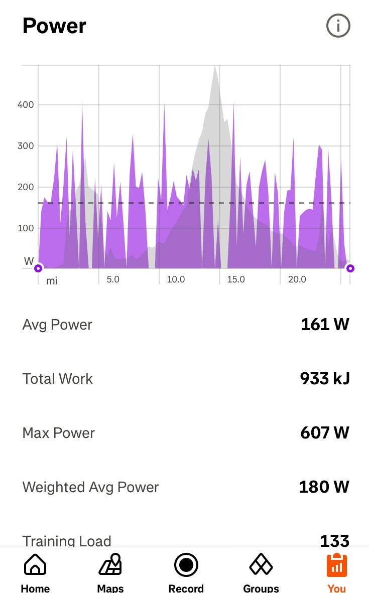
Not talking about the Power Curve Graph but the spikey one below. Anyone know why the maximum power output, and probably others ones too, don’t show? Max power was 607 but the graph tops out at a little over 400.
__________________
“A watt saved is a watt earned” 🚴🏻♂️
 Not a CAT
“A watt saved is a watt earned” 🚴🏻♂️
 01-08-25 | 09:31 PM
#2


I think it's because the power varies a lot from second-to-second, and also because it's compressing the whole ride into a fairly narrow chart.
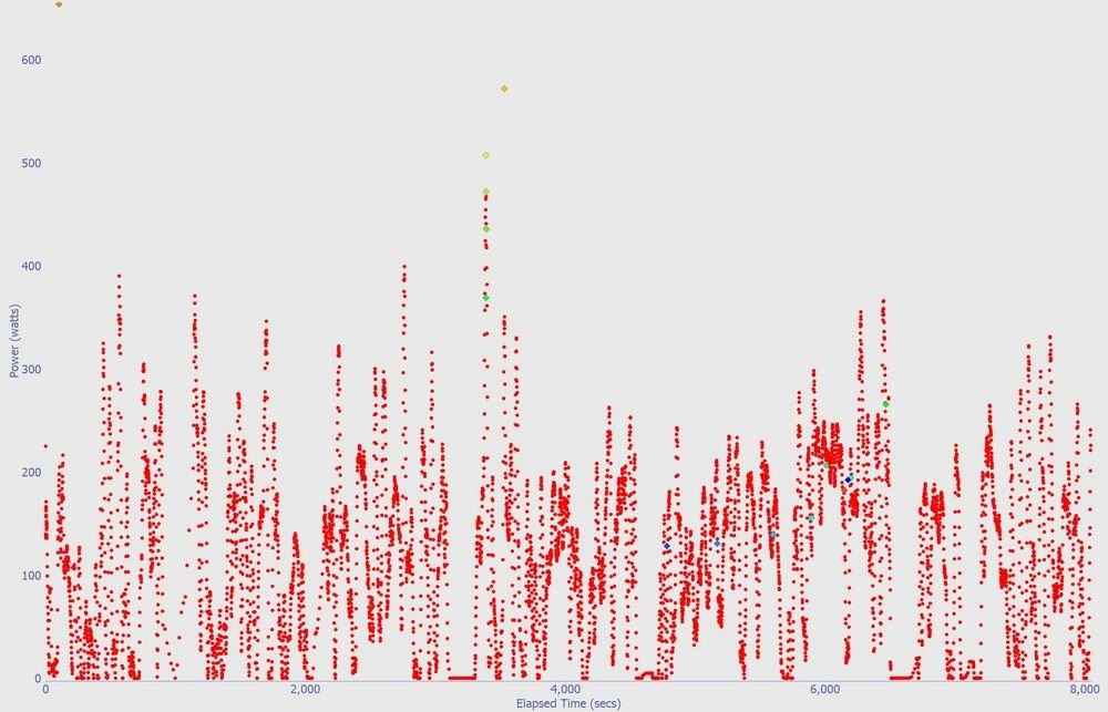
Here's an example of my ride from a couple of years ago, with the charts from the free Golden Cheetah analysis software.
2 hours recorded, 28.5 miles. My Garmin records once per second. A few hard efforts on the hill climbs during the ride.
~~~
The power data with 3 second smoothing. That averages each second using 3 consecutive second's power readings. This smooths out the data slightly.
The big swings in power numbers from second to second was a big surprise to me when my power meter was new. That's why Garmins display 3 second or 30 second averaging, depending on what you want to use the number for.

~~
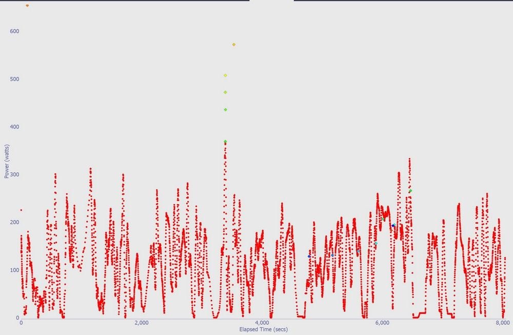
15 second smoothing. The same chart using 15 seconds.
Now it's starting to be a line instead of a scatter plot as the shorter extremes are averaged with adjacent data.
~~~
30 second averaging. This is starting to look like Strava's chart.
~~~~~~~~~~
So, those short duration peak power readings get averaged down by the lower power a few seconds away.
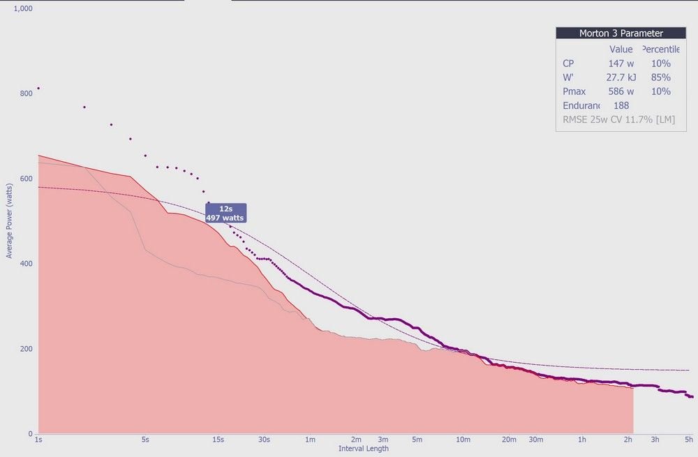
A more interesting way to view the power data is by Golden Cheetah's CP Chart. "Critical Power", where it scans the whole ride and picks out the best power numbers for 1 second, 2 seconds, etc duration.
Strava has a similar chart in the Analysis section, "Power Curve".
Golden Cheetah is more detailed -- for instance, it can show the power for an interval or a hill climb within this CP chart, and can compare the current ride to maximum numbers from a selected range of dates.
It's good for questions like: How much power can I do for 30 seconds? 3 minutes? 20 minutes? Great for pacing climbs and fast flat rides too.
The dark purple line and dots are my 12-month maximums collected from all the rides. (The light, smooth line is a theoretical estimate of possible max power.)
The shaded area is the current ride.
I hovered over the 12 second mark and it popped up the 12-second power number.
I can see that I matched or set the best power numbers in the 10-minute range on this ride. It was a long, steady climb, and I was watching the power for pacing there.
~~~~
The same ride in Strava. It's the same curve, but the x-axis is scaled differently.

Here's an example of my ride from a couple of years ago, with the charts from the free Golden Cheetah analysis software.
2 hours recorded, 28.5 miles. My Garmin records once per second. A few hard efforts on the hill climbs during the ride.
~~~
The power data with 3 second smoothing. That averages each second using 3 consecutive second's power readings. This smooths out the data slightly.
The big swings in power numbers from second to second was a big surprise to me when my power meter was new. That's why Garmins display 3 second or 30 second averaging, depending on what you want to use the number for.
~~
15 second smoothing. The same chart using 15 seconds.
Now it's starting to be a line instead of a scatter plot as the shorter extremes are averaged with adjacent data.
~~~
30 second averaging. This is starting to look like Strava's chart.
~~~~~~~~~~
So, those short duration peak power readings get averaged down by the lower power a few seconds away.
A more interesting way to view the power data is by Golden Cheetah's CP Chart. "Critical Power", where it scans the whole ride and picks out the best power numbers for 1 second, 2 seconds, etc duration.
Strava has a similar chart in the Analysis section, "Power Curve".
Golden Cheetah is more detailed -- for instance, it can show the power for an interval or a hill climb within this CP chart, and can compare the current ride to maximum numbers from a selected range of dates.
It's good for questions like: How much power can I do for 30 seconds? 3 minutes? 20 minutes? Great for pacing climbs and fast flat rides too.
The dark purple line and dots are my 12-month maximums collected from all the rides. (The light, smooth line is a theoretical estimate of possible max power.)
The shaded area is the current ride.
I hovered over the 12 second mark and it popped up the 12-second power number.
I can see that I matched or set the best power numbers in the 10-minute range on this ride. It was a long, steady climb, and I was watching the power for pacing there.
~~~~
The same ride in Strava. It's the same curve, but the x-axis is scaled differently.
Last edited by rm -rf; 01-08-25 at 09:50 PM.
01-09-25 | 09:15 AM
#4
Senior Member

Joined: Dec 2010
Posts: 9,686
Likes: 2,605
From: northern Deep South
Bikes: Fuji Touring, Novara Randonee
Strava will probably call it proprietary. You might have one of the Golden Cheetah developers respond, and I'm pretty sure you can dig it out of the source code from github if you desperate or motivated enough.
01-10-25 | 09:40 AM
#5

Senior Member
Joined: Mar 2024
Posts: 1,948
Likes: 784
From: San Diego
Bikes: Columbine, Lynskey GR300, Paramount Track Bike, Colnago Super (4), Santana Tandems (1995 & 2007), Gary Fisher Piranha (retired), Bianchi Track Bike, a couple of Honda mountain bikes
Veloviewer connects to Strava and pulls down all the data captured by your bike computer
01-13-25 | 06:58 PM
#8
“We don’t need no badges”
Joined: Sep 2019
Posts: 2,606
Likes: 1,628
From: SF Bay Area
Bikes: 1981 Holdsworth Special, 1993 C-dale MT3000 & 1996 F700CAD3, 2018 & 2019 Cervelo R3’s & 2022 R5, JustGo Runt, Ridley Oval, Kickr Bike 8-)
If you want better graphs and not those Strava caricatures, try Intervals.lcu
Has a free level, but I choose to support and pay for it.
Barry
Has a free level, but I choose to support and pay for it.
Barry
__________________
