


Decal Design Feedback
 05-08-14 | 08:19 PM
#1

Thread Starter
Senior Member
Joined: Apr 2014
Posts: 87
Likes: 0
Decal Design Feedback
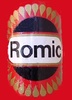
Hi there, I am in the midst of a vintage restoration and designing some custom decals in p-shop that will be produced from a local vinyl printer. Just wondering what your opinion is toward these 2 general concepts, or if you recommend another design altogether. Any criticism is welcomed. 


 05-08-14 | 08:23 PM
#2


Administrator


Joined: Apr 2005
Posts: 34,328
Likes: 8,481
From: Hudson Valley, NY
Bikes: Merlin Cyrene '04; Bridgestone RB-1 '92
I like the top one, although the other one isn't bad. I'll give them a 9 and a 7.5 respectively.
__________________
See, this is why we can't have nice things. - - smarkinson
Where else but the internet can a bunch of cyclists go and be the tough guy? - - jdon
05-08-14 | 09:05 PM
#3
Senior Member
Joined: Aug 2013
Posts: 877
Likes: 12
From: NYC
Hmmm, Can't lose with either of those. Having said that I think I prefer the bottom one - just looks more streamlined and sharper to me; whereas while I dig the tricolor accents on the panels, it looks more common or expected or something to me, maybe? Splitting hairs though.
05-08-14 | 09:07 PM
#4
Thread Killer

Joined: Aug 2008
Posts: 13,140
Likes: 2,162
From: Ann Arbor, MI
Bikes: 15 Kinesis Racelight 4S, 76 Motebecane Gran Jubil�e, 17 Dedacciai Gladiatore2, 12 Breezer Venturi, 09 Dahon Mariner, 12 Mercier Nano, 95 DeKerf Team SL, 19 Tern Rally, 21 Breezer Doppler Cafe+, 19 T-Lab X3, 91 Serotta CII, 23 3T Strada

 05-09-14 | 03:50 AM
#8
Senior Member
Joined: Jun 2013
Posts: 217
Likes: 20
From: tennessee
Bikes: '13 Trek Madone 5.2 '14 Giant Thrive - (wife's)
You mentioned "vinyl printer", If they are indeed going to be printed, I would find a shop that will cut characters to shape, that are in turn applied with a removable, low-tack, carrier sheet. Obviously this rules out the multi-color first option via "printing". Apply the vinyls in individual colors if that is the look you decide upon; and specify 7 or 9 year premium grade vinyls in a 2mil thickness. Today, this type of material is available in matte finishes but is usually seen in a high gloss. Unfortunately, most shops use substandard vinyls these days to increase their bottom line and the print guy's inks are even less durable/stable. Sometimes they suggest a UV overlayment...the result is usually thick in dimension and lacking sharpness in the graphic. The cut vinyls used to be the norm...with the new print mediums; shops stock cheap white vinyl and even cheaper inks to do mostly large formats that don't require sharp details. Shop around, ask questions, and find an old school location that will provide you with a quality product that looks good up close. Another option would be to find a reputable pinstriper and have it done in paint. The old school sign shop can even provide you a computer cut stencil in a low-tack vinyl known as "paint-mask" (this will be white or yellow in color with the letters open in a bordered area), which your striper will apply to your frame and brush apply paint through. Sorry for the long explanation, but the whole print decal thing just leaves me cold since its become such a widespread art quality killer.

 05-09-14 | 09:55 AM
#14


Behind EVERYone!!!
Joined: Jan 2005
Posts: 6,029
Likes: 111
From: Burlington ON, Canada
Bikes: 2010 Specialized Tricross Comp 105 Double
Bottom one for me, but, they both really look clean. Nice job.
__________________
�A good teacher protects his pupils from his own influence. �
― Bruce Lee
�A good teacher protects his pupils from his own influence. �
― Bruce Lee

Thread
Thread Starter
Forum
Replies
Last Post
The Thin Man
Classic & Vintage
27
07-27-11 02:35 PM
